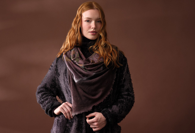
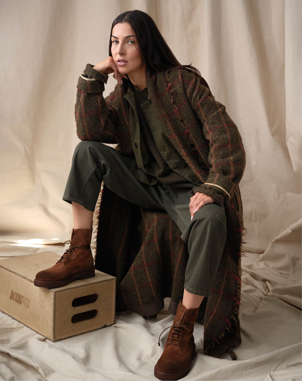
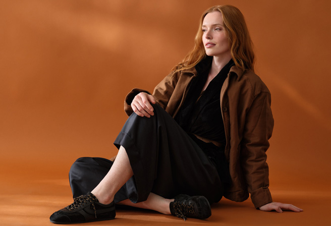
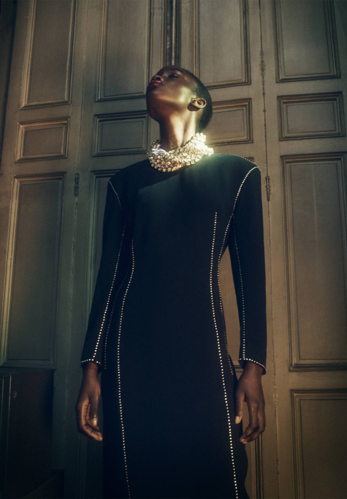
The crossover between the three Rundholz lines may not be immediately obvious – designers Carsten and Lenka Rundholz certainly work diligently to ensure that each is distinct.
Yet, as their philosophy has dictated for over 20 years, the lines blend together seamlessly both season to season and across Main Line, Black Label and DIP.
Combining all three opens a world of possibility in texture and tone – an approach we are delighted to share in this first fall delivery.
The collection is a love letter to all things knit – oversize turtlenecks, punchy pullovers and sophisticated shrugs feature heavily across the delivery alongside a selection of casual pants and thick scarves.
Special fringing details are of particular note, seen in cropped cardigans and cozy tunics throughout Black Label.
By bringing together the avant-garde styling of Main Line, the experimental finishes and dyes of DIP and the casual ease of Black Label, we find a stylistic voice that could only be Rundholz.
Carsten’s muse has always been Lenka, intending for the collections to reflect her unique style and strength, creating armor for the modern wearer that is simultaneously intellectual and extremely wearable.
Maison de Vacances began with the motto, “dress your house as you like to dress.”
This philosophy, and the connection to personal style, is readily apparent within their offerings where they create a wide range of pillows, bedding and throws to complement the modern home.
Cotton velvet, nubby linen and elegant jacquard reign supreme here – begging to be paired together with a plush cashmere throw or a striking antique textile.
The line is a celebration of texture and color. With sophisticated palettes and a variety of finishes, Maison de Vacances melds into almost any decorating style.
Extremely versatile, the pillows make an ideal backdrop for bold accents while also working well on their own as a landscape of soft cotton and linen.
The entirety of Maison de Vacances is designed and made exclusively in France to ensure their high standards of quality.
This level of care is apparent within every seam – perfect ruffles, tight stitching and smooth finishes that promise the simple peace of classic, well-made home goods.
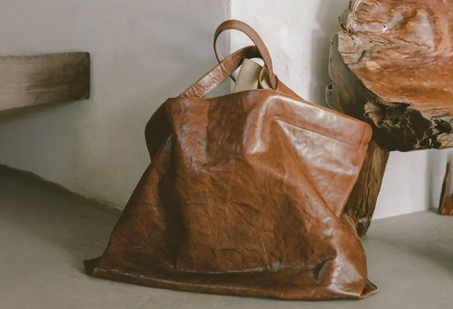
When considering the everyday handbag, silhouette, style and soul are top of mind. In this arena, Corîu’s work stands alone.
They present collection after collection of pieces that are not only classic, but structurally and sculpturally beautiful.
Each bag represents a legacy of dedicated craftsmanship – designer Giordano Lapegna’s roots in the leather industry date back to the late 1800s.
Corîu crafts their bags from organic Tuscan leather, a full-grain hide known for its earthy texture and finish.
The pieces are vegetable tanned using natural hardwoods such as Quebracho and Japanese Mimosa in a process that transforms the material from a rough, raw state into the soft, lush polish synonymous with high-quality Italian leather.
This treatment of leather, suede and brass come together in a symphony of timelessness.
Lapegna and his team refer to this as “the magic of the handmade” – a special quality held by goods that eschew mass production.
Unique and deliberate, each handbag is imbued with characteristics and personality inherent to the hand-making process.
This philosophy is plainly felt within Corîu’s work… a celebration of the true essence of craftsmanship.
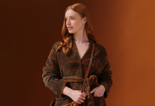
Founded over twenty years ago by designers Michel Bergamo and Cristina Zamagni, Boboutic was created with the goal of translating their everyday experiences in Firenze into knitwear.
Combining traditional knit and stitching techniques with intellectual textile research, they have achieved an unmatched collection of coats and sweaters with a marshmallow-like softness, owing to the high pile of their silk and cashmere threads.
The versatility of knits makes them an ideal medium for the Boboutic studio, allowing Michel and Cristina creative freedom in conceiving each piece.
True to their artistic background, they think of each coat as a sculpture – building the knits in the same way a ceramicist would add clay.
The yarns are carefully considered and kept in an endless line throughout each garment, without needing to use any scissors or cutting instruments.
Rendered in a neutral palette of brown, black and tan, Boboutic’s pieces are an ideal choice for fall layering.
“I spent much of spring sleeping under the light of the moon,” says Christopher Duncan when thinking of his creative process while making his Luna collection.
Life was, and is, still quiet in New Zealand, where he lives among the tall pines of the coast.
It was there that he found inspiration in antique Japanese silk and jute yarn – creating a series of one-of-a-kind scarves that capture the reflection of the night sky on the water.
Midnight tapestries come together in a powerful sweep of linen, jute and cotton in Luna VII. Interspersed silk yarns add an element of drama to the design.
In a creamy sand color, the lighter Canvas series echoes both the rocky beaches of New Zealand and the classical artistry of Christopher’s tutelage.
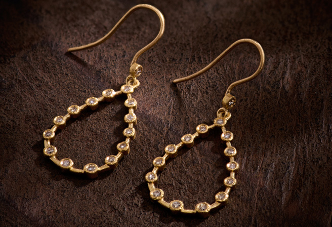
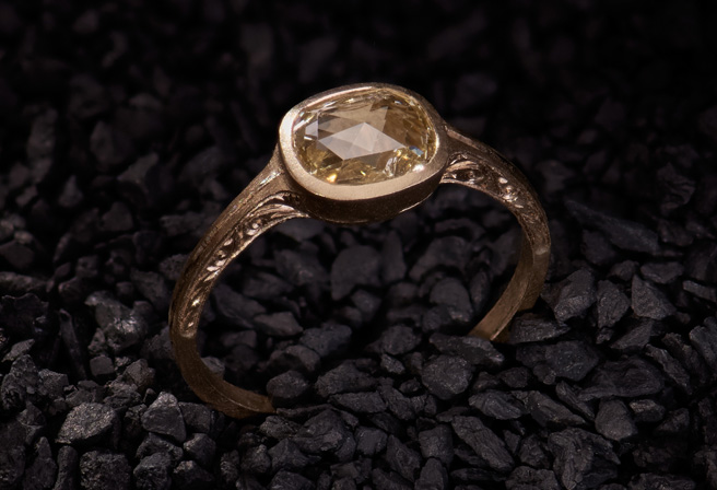
Mallary Marks, a New York based jeweler trained at the renowned Rhode Island School of Art and Design, has a special knack for teasing out the best properties within precious gems.
Within each piece she captures a world of vibrant color – heavily influenced by the art of Alexander Calder, Odilon Redon and Henri Matisse.
Plump emeralds dangle lightly from double drop earrings. By polishing the jewels instead of faceting, Mallary unveils the lush jardin within. Warm gold in 18K and 22K elevates her candy store of exquisite gems to their sunniest, most elemental state.
Mimicking Calder’s complex hanging sculptures, Mallary suspends gems, such as Ceylon sapphire, kyanite and aquamarine, from gold hoops in many of her pieces. The contrast of juicy, clear gems against the dark lustre of hematite and onyx nods to the graphic shapes of Matisse.
Mallary Marks’ jewelry is ultimately fresh and delightful. Her concepts are developed freely, in a creative stream of consciousness that invites unbridled artistry into each piece.
She does not shy away from unusual gem or color combinations, allowing her work to fit seamlessly into the worlds of both delicate evening wear and favorite everyday adornment.
“While I recognize the necessity for a basis of observed reality… true art lies in a reality that is felt.”
For fall, Uma Wang looked to disparate cultural symbols and a wide range of ultra-tactile fabrics to construct her motif-blending collection.
Donning wide-brimmed hats and broad-strapped bags, her models exhibit her unique and sumptuous designs in a nod to the idyllic rancher – an earthy, nostalgic aesthetic in stimulating textures and muted tones.
Looking ahead to cooler days, Uma’s garments combine wool and eco-alpaca fur, a sustainably harvested textile, to craft elegant and feminine knits with just a hint of her avant-garde roots.
Cozy cardigans and sweaters are dyed with deep, rich magentas that run alongside lighter, caramel browns.
Meanwhile, decorative floral prints sprawl across the lightly embellished surfaces of her layer-ready jackets and coats.
Fringed edges and generous silhouettes mimic the folk hero of the pastoral Gaucho, the cowboy of the South American pampas – without sacrificing the bold femininity Uma is renowned for.
A master of both transitional wear and full–on autumn dressing, Uma Wang’s vast library of inspiration encourages us to step out of our figurative stylistic stables and into the exciting unknown landscape of fashion to come.
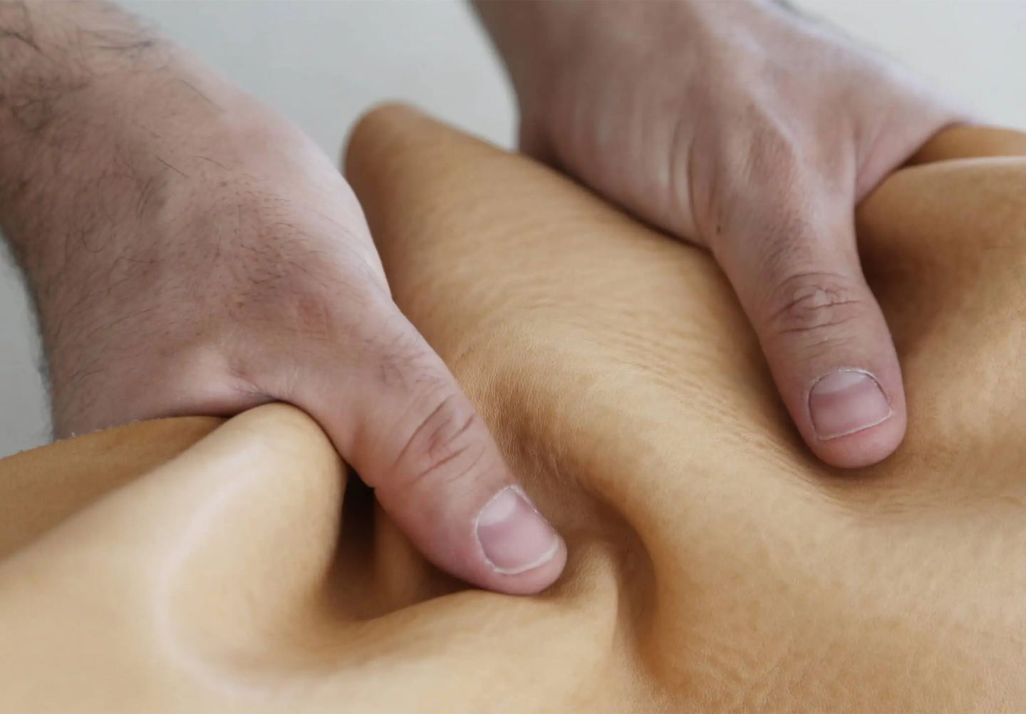
Malfatti, translating to “misshapen” in Italian, is not just a glassware studio, but a physical expression of creativity.
Named for a type of hand-rolled dumpling, this distinct collection was a collaboration between Daniel Spitzer, a former Chihuly glassblower, and Jill Reynolds, an award-winning visual artist and flameworker.
Each unique glass is shaped freely using only hand tools and the breath of the artisan making it.
Made of borosilicate, the same lightweight glass used in laboratory flasks and high-end cookware, Malfatti’s pieces are soft in the hand without sacrificing the durability needed for everyday use.
Camaraderie is alive and well within their ethos – in the pursuit of ensuring no one ever drinks alone, their glassware is available exclusively in pairs.
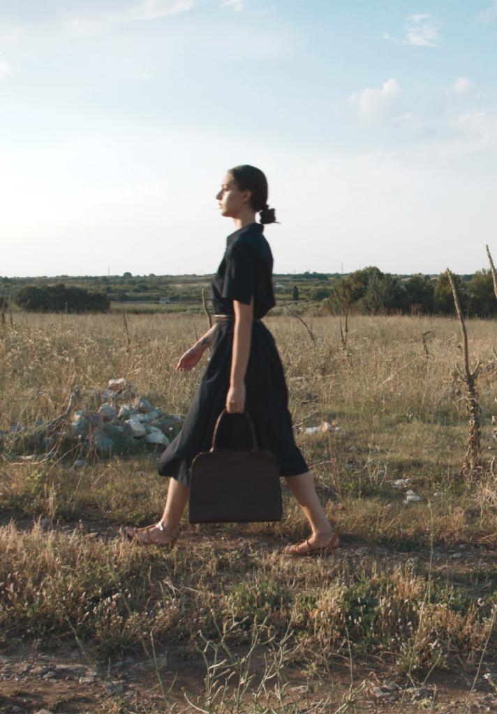
Corîu portrays its influences through expertly crafted leather handbags that evoke a nostalgic trip to the idyllic Italian countryside.
Images via Corîu
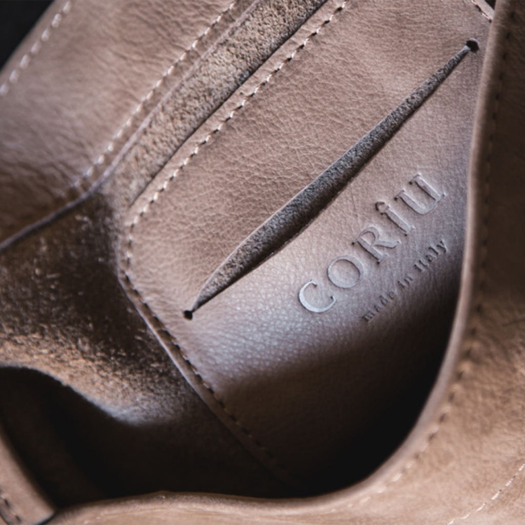
The art of “maroquinerie,” Italian for “leather making,” is, both literally and symbolically, in Corîu’s blood.
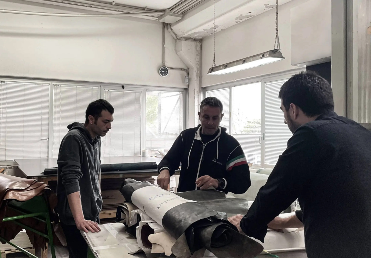
The brand was founded in 2019 by Giordano Lapegna.
With his own background as a creative mind and designer for a company working in leather, for five generations, Giordano’s family has crafted and sold leather goods.
From humble beginnings of his great-great-grandfather selling leather across Southern Italy to his grandparents and their children running influential leather trade businesses in Naples, the material has been connected to Giordano’s family for over 100 years.
Not only is his familial line deeply tied to fine leather, but his cultural roots, along with the brand itself, are intertwined with Italy’s Puglia region, an area steeped in the tradition of craftsmanship.
These influences are not lost in Corîu’s refined aesthetic.
Each bag radiates romantic sentiments of Italy, inviting the wearer to take part in the country’s storied culture.
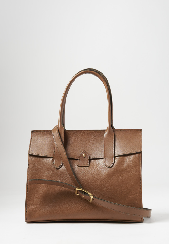
Corîu’s “Bitta” bag alludes to the maritime history of the peninsula.
Bitta, the Italian word for “bollard,” refers to the hooks along docks for sailors to fasten their boats to.
The bag’s golden clasp which secures its rounded, triangular latch mimics these hooks.
Classic, elegant lines define every piece, exuding the brand’s historical origins as well as the locally-focused and sustainable principles it was founded on.
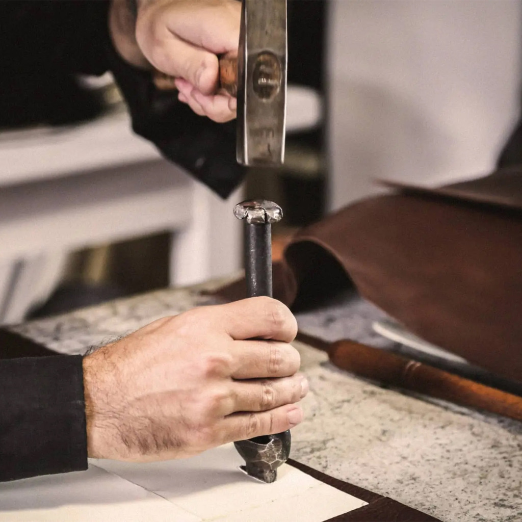
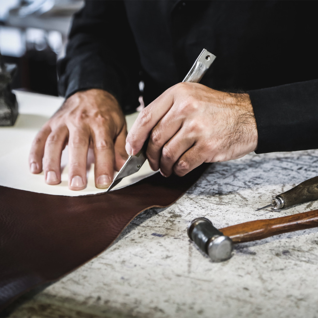
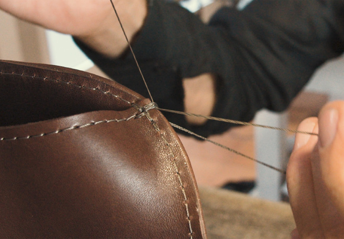
Collaborating with Puglian artisans and family-run businesses, each and every detail is accounted for as the leathers are cut, assembled and stitched by hand.
Embracing slow fashion practices, Corîu’s Tuscan-sourced leathers are vegetable tanned and dyed, an ancient and eco-sustainable process that produces a sophisticated, organic appearance that subtly changes over time, reflecting the wearer’s lifestyle.
With a brand defined by its Italian roots, Giordano’s combination of his leather crafting heritage and design background result in Corîu’s elevated handbags.
For Fall, Gilda has dived into palettes both new and familiar.
Steel Planet swims in copper and silver tones.
Golden Diamond is a splash of bronze and black set against cream.
Nighttime ocean waters lap the shore in her expression of Aquamarine.
Understanding that freedom in both form and feeling mean different things to different people, Gilda Midani explores feminine styles, such as the Bloom dress and the Gilet Jacket, alongside sportier silhouettes in the Square pullover and the Monoprix tee.
In 2004 Carsten and Lenka Rundholz branched out from their main Rundholz line into the world of dip-dye and modern art as fashion.
Created in collaboration with Japanese dye artists, Rundholz DIP was born as a natural evolution of the duo’s already avant garde ready-to-wear.
With experiments conducted in Carsten’s countryside studio, DIP’s swinging silhouettes and specialty fabric treatments capture a uniquely adventurous feeling with each garment.
The stars of this label are the textiles – by choosing a more substantial weight of cotton, Carsten and Lenka are able to build sculptural, but comfortable, forms.
In this delivery, we see the combination of zipper pockets, decorative hoods and patchwork details that nod to the line’s original street and sportswear influences.
For FW22, Pierre-Louis Mascia titled his collection Ran — a word that translates to both “chaos” and “battle” in Japanese.
Inspired by the Akira Kurosawa film of the same name, Pierre-Louis describes his own battle as “for the survival of beauty.”
Working in his chosen medium of brightly patterned silk and cashmere, he defines the wardrobe of the modern aestheticist.
Pierre-Louis draws his motifs from a wealth of global inspiration: from the sleek bottle design of perfumer Serge Lutens and the futurist art deco paintings of Tamara de Lempicka to medieval Japanese samurai garb and traditional Navajo weavings.
Despite their disparate patterns, the prints blend together in a rich harmony.
Tartan, florals, regimental stripes and antique woodcuts splash across his silks for a divinely maximal aesthetic that is unabashedly Pierre-Louis Mascia.
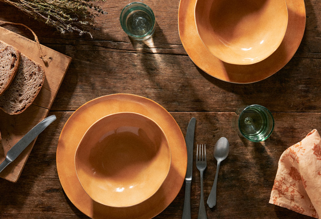
To Laurie Goldstein, the artist’s table is one to be admired – its pieces do not come together easily. Instead they are found, collected, gathered one by one over a lifetime.
The disparate shapes tell a story that brings us together, celebrating the perfect imperfections and idiosyncrasies that create a favorite gathering.
Laurie Goldstein’s collection is an echo of this storied pursuit – her hand hewn, hand painted, and hand finished plateware each a distinct work of art.
Fully functional, Laurie Goldstein’s pieces are intended to enjoy a meal, or two, or three… while still relishing the creative canvas upon which the dish was built.
Her lifetime of ceramic passion and rich personality shine through the speckled glazes and bold splashes of color.
Hues range from Mediterranean blues and greens to modern monochrome in black and white.
Though her palettes each speak to a different style of table – one eclectic and bohemian, the other minimalist and refined – both are distinctly Laurie.
Her painterly brushstrokes a nod to their sisterhood, her signature unglazed edge the connecting motif. Combined in any number of arrangements and one discovers an artist’s table all their own.
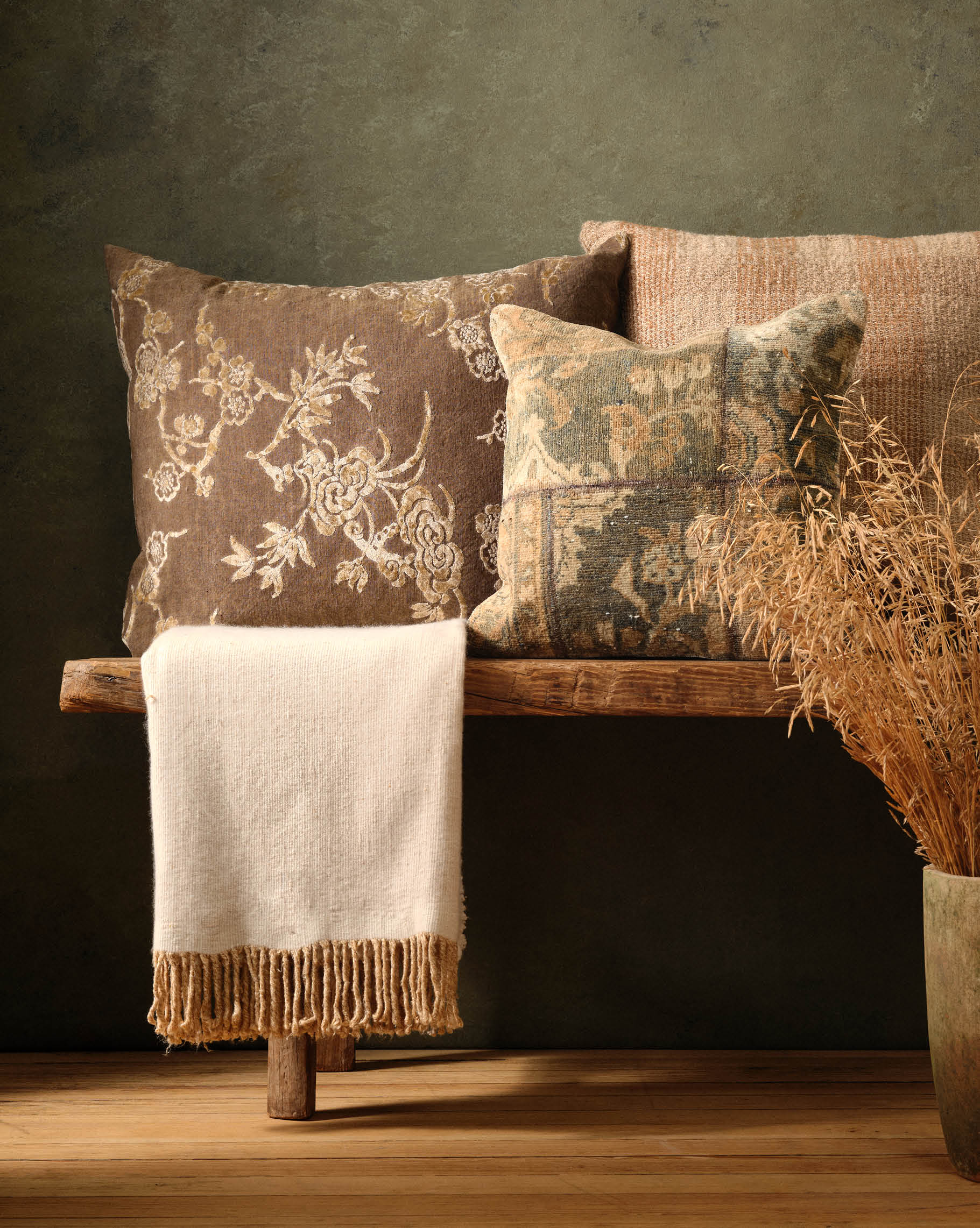
Prizing pure fabrics in soft finishes, Album di Famiglia’s fall collection is guided by their core principle: simplicity.
Oversized button coats, soft draping turtlenecks and straight leg drawstring pants define the delivery’s silhouettes – each pleasant on their own but divinely textured when layered together.
In each piece cuts are made in perfect harmony with clear shapes, colors are chosen to complement and not overwhelm and fabrics are specially woven and knit to feel heavenly against the skin.
Of special note is the Rusconi’s continued exploration into cotton velvet – a smooth, but sculptural textile they present in navy, midnight and warm ochre.
Though these pieces take center stage, they are joined by a host of cashmere jumpers and Album’s signature crisp cotton shirting for a transitional fall wardrobe that revels in the simple things.
“Beauty of style and harmony and grace and good rhythm depend on simplicity.”
Distilling the aesthetics of the French countryside is deceptively challenging.
The look is austere but not stuffy, humble but not ordinary, antique and yet completely modern.
Benoît Astier de Villatte and Ivan Pericoli accept this challenge with relish – a Parisian legacy of artisanal, handmade ceramics apparent within every piece they make.
Cast against this simple backdrop, Alexandre’s presence invites an intimacy to the table.
The core motif of their Alexandre collection: a cherubic face rising from Astier de Villatte’s signature milky glaze. Modeled after an aged imprint found in Benoît’s father’s attic, the visage is soft and enigmatic.
Though each style maintains an individual character, the unifying white palette allows for imagination in designing the table. A pair of Aurélie plates, Marguerite bowls and an Alexandre platter – the perfect setting for two.
His inherent classicism brings to mind French spreads of yore – tumbling apples, fresh bread and mint gracing a hand-hewn wooden surface.
This presentation is not without whimsy – perhaps there is a splash of génépi in one of his tea cups or a scoop of lime sorbet in his simple fruit bowl.
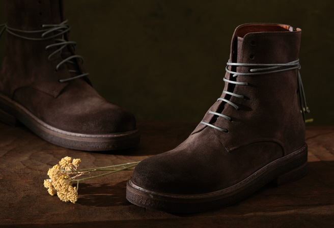
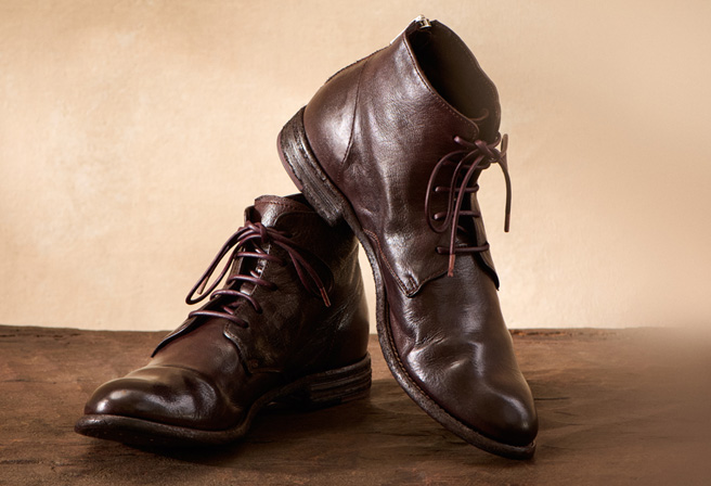
In Teodorano, Italy, the place of Marco Campomaggi’s birth, everything is made by hand: doors, clothing, tableware and, of particular note, leather goods.
This appreciation of craftsmanship is alive and well within each Campomaggi handbag – the sumptuous leather and brass accents a celebration of the maker’s touch.
In several styles, hundreds of delicate cutouts are carved across the leather in a nod to motifs of western vintage. The addition of bold hardware adds an edge to the earthy, but feminine aesthetic.
In others, Campomaggi goes fundamental – uncomplicated silhouettes that fit seamlessly into many wardrobes. The core of this collection is the nuanced variations in the finished leather created through Marco’s signature piece-dyeing process.
Marco’s deep bond with his origin has informed every part of the Campomaggi approach, from the hand-hammered rivets to the Teodorano castle stamped on his logo.
This pride in provenance imbues his work with a legitimacy only found through the pursuit of excellence across generations – ensuring each Campomaggi bag is timeless.
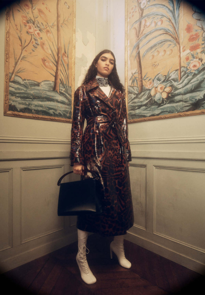
For A/W 22, Dries Van Noten is levying the power of nostalgia to lend an added weight to his polished, contemporary line.
Image via Dries Van Noten
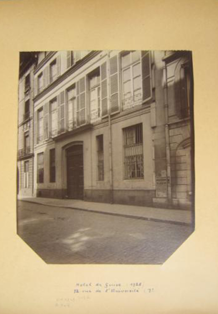
At 72 Rue de l’Université in Paris stands a centuries-old mansion.
Archival 72 Rue de l’Université Facade Image via Eugene Atget
Known in a past life as the Hotel de Guise, the now dilapidated manor’s elegance can only be recognized through the hints of its interior’s survived intricate detailing as well as opulent materials and exquisite construction.
But upon seeing these clues – hiding in plain sight – viewers can feel themselves brought back to the far-gone 18th century heyday of this lavish maison.
The sight creates a form of nostalgia stemming from the romantic glimpse of a Paris lost to history.
Image via Dries Van Noten
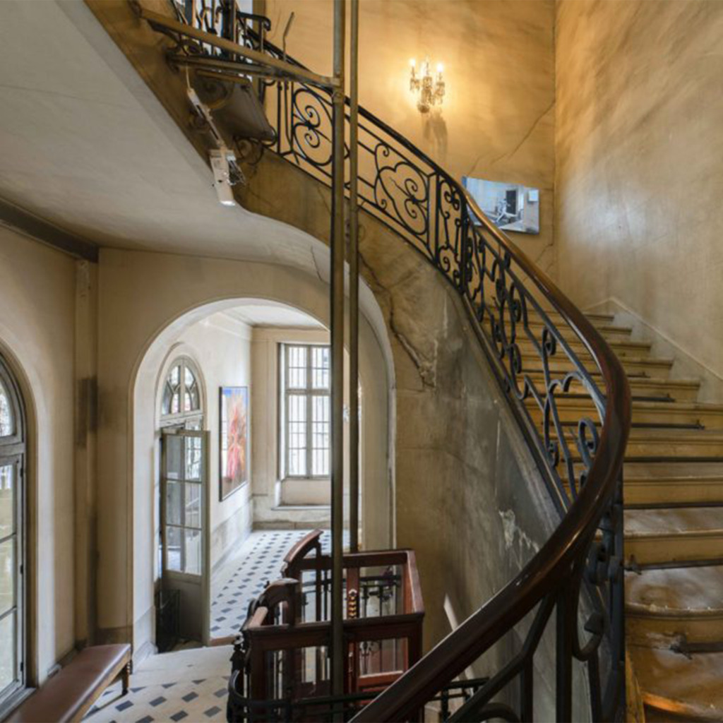
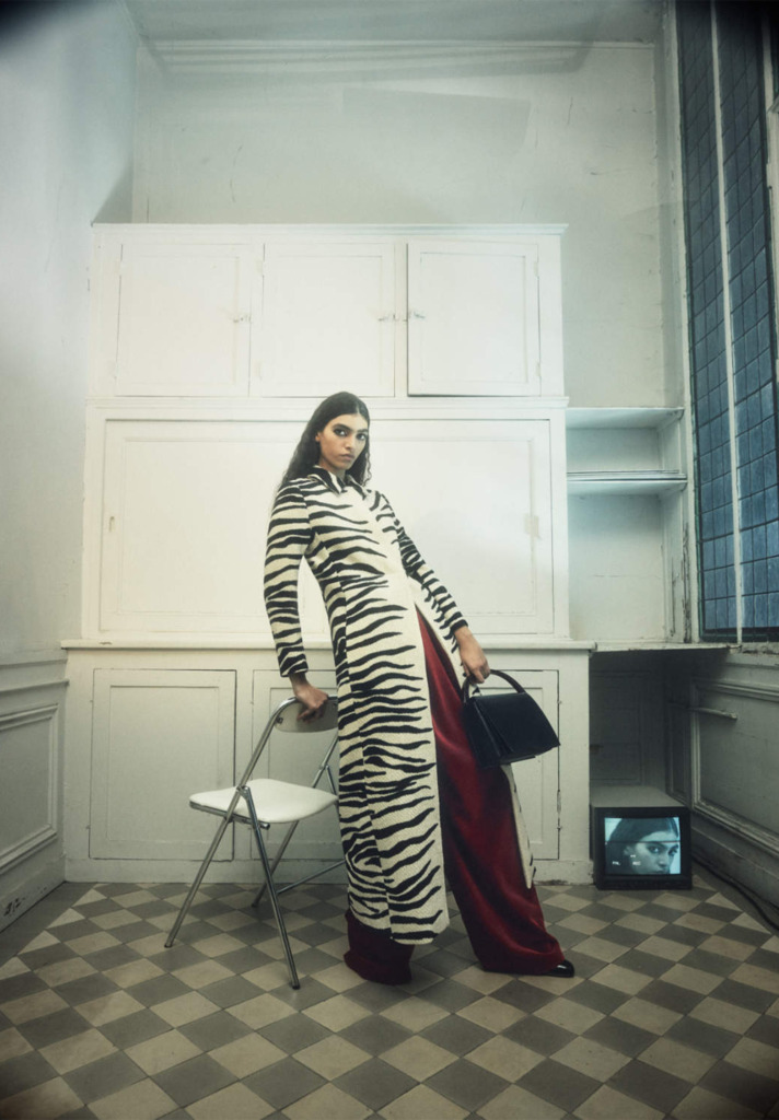
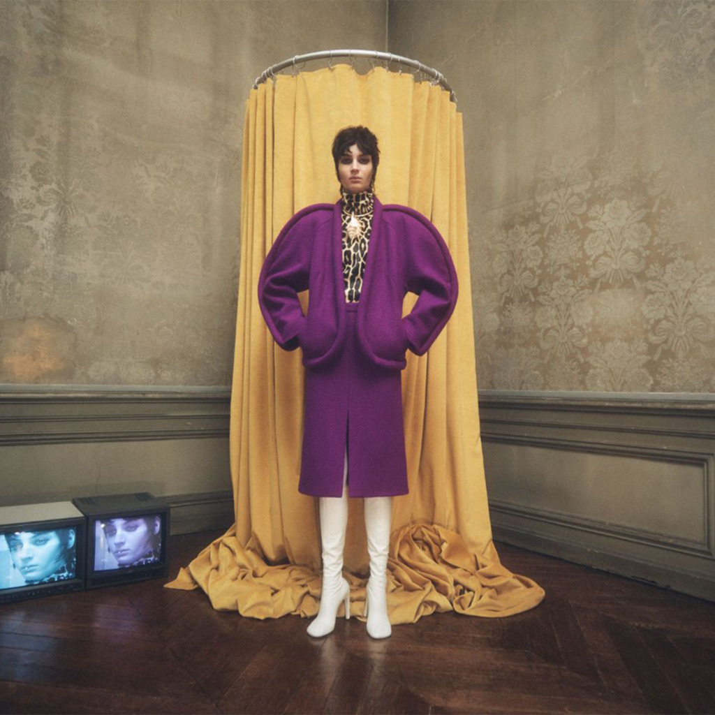
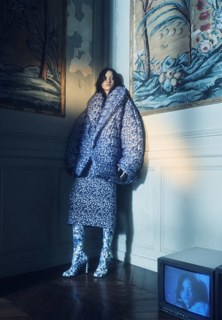
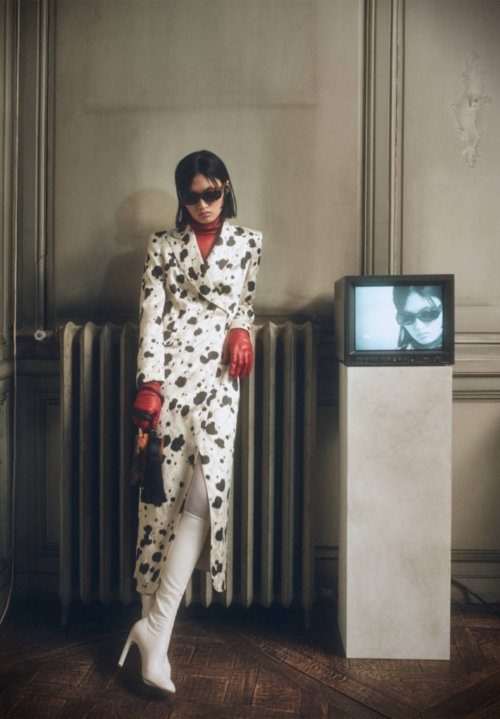
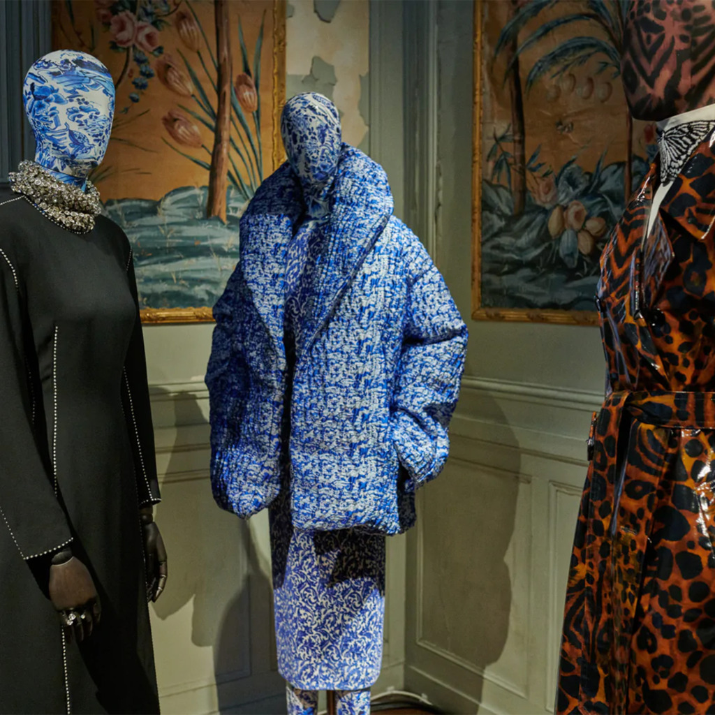
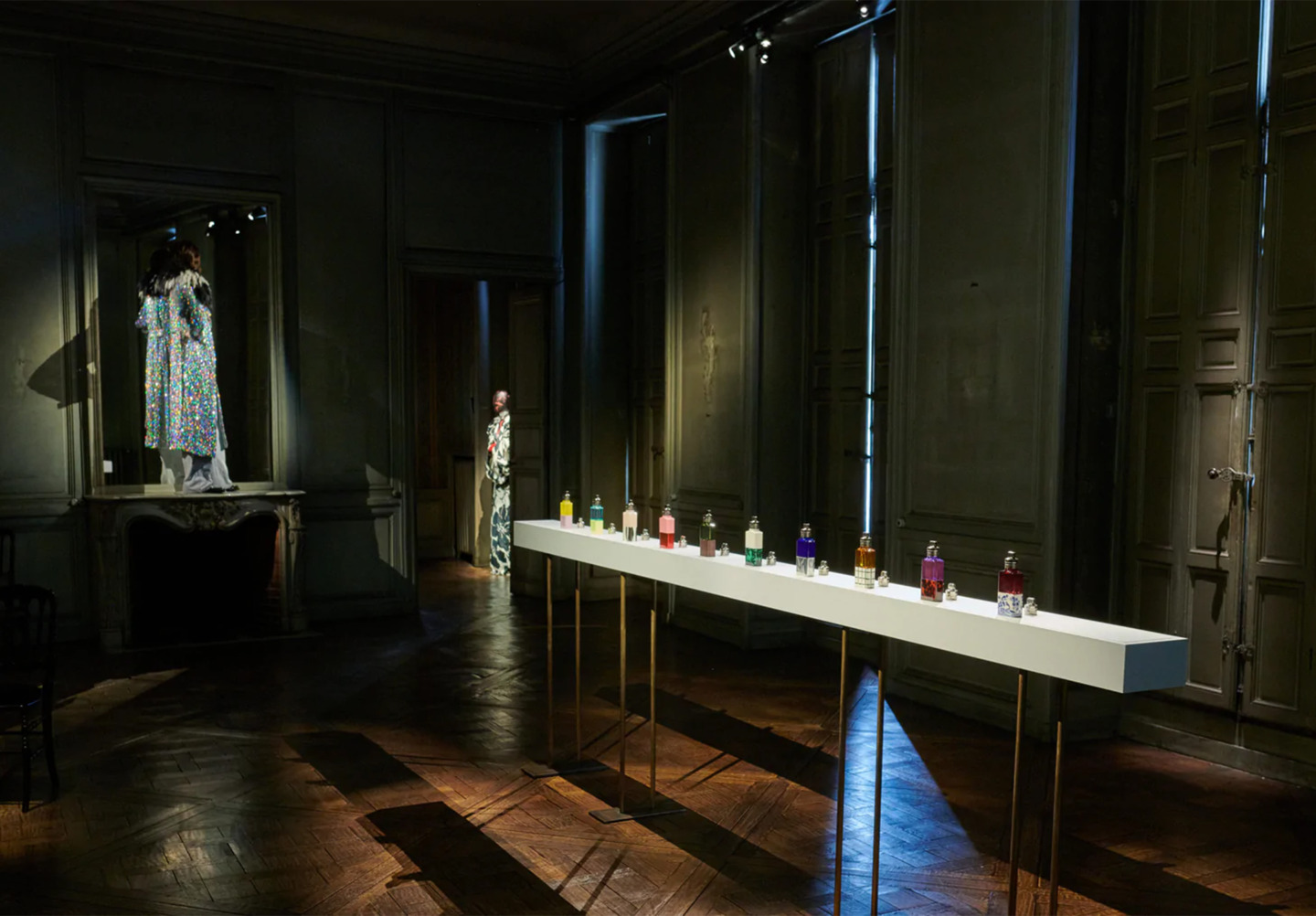
It is in this nostalgic realm that we find a backdrop for Dries Van Noten’s Autumn/Winter Collection.
Avoiding the runway for health safety concerns, Dries opted to exhibit this new line within the Hotel de Guise.
For the lookbook, Dries took inspiration from the mysterious Italian architect and designer turned renaissance man, Carlo Mollino.
Self-Portrait via Carlo Mollino
In Mollino’s clandestine hideaway in the center of Turin, Italy, a collection of polaroids were found which featured sensuous female portraits posed against the extravagant settings of the artist’s two homes.
Taking lead from this influence, Dries chose to visually reference these portraits taken in vintage, luxurious interiors, while replacing Mollino’s erotic slant for one of female strength and empowerment.
Draped in this line’s lush, sometimes decadent designs of animal print as well as ornate china patterns and a number of other fantastic motifs, the models are placed in powerful poses, starkly contrasting the aged, decaying interiors of Hotel de Guise.
Adding to the nostalgic themes, the models were photographed alongside the mansion’s antique decorations and CRT televisions displaying low resolution images of their faces veiled by the grain and noise of VCR-like static.
To substitute a conventional runway show, Dries used the rooms and halls of the Hotel de Guise to exhibit cinched silhouettes and sophisticated arrangements, generously applied with indulgent designs and ornamentation, on mannequins, either faceless and shrouded in dyed patterns or adorned with eye-popping and lip-defining makeup.
In addition to the clothing line, Dries chose to present his new fragrance collection – a long-awaited reveal since his brand’s acquisition by perfume and fashion company Puig.
These fragrances, inspired by Dries’ skill of pairing contrasting colors in his clothing designs, exhibit expertly clashing scents such as mint and iris as well as packaging the perfumes in unique material combinations such as wood and glass.
From historic craft to symbol of free spirits to runway prestige, the iconic artform of tie-dye has experienced a storied past.
Tie-Dye is in.
This is not news to anyone paying attention to designers unveiling their retro-inspired lines season after season.
Image via Gilda Midani
Although these looks may take viewers back a half-century to the American 60s, the artistic technique of selectively dyeing portions of clothing and fabrics dates back well over a millennium.
Tie-Dye is one of many forms of “Resist-Dye,” a term referring to a collection of various techniques where craftspeople restrict certain portions of a garment while exposing others to dye.
These techniques come in many styles capable of producing a multitude of designs – each one-of-a-kind.
Mongolian Mosen Tea Ceremony Cloth Image via Robert Bengston
Resist-dyeing can be traced back 4,000 years to the Indian practice of Bandhani, while the first traceable act of actually tying the fabric before dyeing can be found in the dyed textiles of the Bai people of the Yunnan province in China around 1,500 years ago.
Women wearing Bandhani garments ca. mid-19th Century via William Johnson and Southern Methodist University
Over the centuries, many cultures have developed their own version of resist-dyeing.
The Japanese used the art of Shibori and clamp-resisting.
In Indonesia, artisans employed their Tritik technique.
The West African Yoruba people indigo-dyed fabrics using Adire.
On the other side of the world, the Nazca culture of Peru created standout geometric patterns through their Amarra technique.
Despite this history of resist-dye coloring techniques, the practice had not yet become common in European cultures and those that stemmed from them.
With the emergence of synthetic dye technology in the mid-19th century, dyeing clothes and garments at home was a familiar practice in the United States… done to give old items a fresh look and avoid spending money on new products.
It wasn’t until the early 20th century when resist-dye techniques would be introduced to Americans.
Synthetic dye technology continued to improve and became more accessible to the public, while at the same time, the late 1800’s Arts & Crafts movement was bringing widespread appreciation and popularity to decoration and handmade goods.
Video by British Pathé
The Monroe Chemical Company, a prominent dye manufacturer of the time, even included an introduction to “tied dyeing” with tutorials of how to achieve specific designs in a 1928 catalog.
Although this early era of tie-dye brought the artform to the US, this awareness paled in comparison to the cultural phenomenon it would become just a few decades later.
Festival Image via Popperfoto
The American 1960’s brought several counterculture ideals to the mainstream, including hippies.
Among the many philosophies tied to hippies were that of the DIY movement, distaste for identical, mass-produced goods, the interest in and embrace of the crafts of different cultures, and the use of psychedelics.
Ken Kessey and the Merry Prankster’s Bus Image via Jeremy Hogan
The visual characteristics and production methods of tie-dye just so happened to coalesce with these categories, with its foreign roots and accessibility to create one-of-a-kind pieces, as well as its ability to present intense, abstracted colors similar to the experience of an acid trip.
These factors all came together, allowing the style to take hold of the counterculture and become the movement-defining, iconic look of the era.
John Sebastian Making and Wearing Tie-Dye Images via Henry Diltz
This pivotal adoption can partially be credited to musicians donning the colorful attire at the infamous Woodstock concert of 1969, as well as the commercial efforts of the Rit dye company.
Image via Rit Dye
Rit’s marketing had previously been aimed at the original, frugal American use of dye, but their new marketing manager, Don Price, searched for a novel market by working with New York City artists to help promote the look of tie-dye.
1958 Rit Dye Advertisement
1970’s Rit Dye Advertisement
This collaboration paid off, sending the style to Woodstock and beyond.
John Sebastian Performing at Woodstock Image via Henry Diltz
After this success, Price wasn’t finished with influencing hippie culture.
He turned to high fashion, eventually catching the attention of the designer Halston who went on to present various tie-dye designs seen in Vogue throughout the early 1970’s after being introduced to Rit dyes.
Early Halston Tie-Dye Designs
Following Halston’s creations, tie-dye was solidified in luxury fashion, serving as inspiration to other designers.
Halston Tie-Dye Dress ca. 1972 Image via Duane Michals
Although tie-dye will likely never again reach the heights of its 1960’s zeitgeist, it’s having a particularly unique moment as of late.
Straying away from the primary colors and simple patterns of the hippies, current designers utilizing the style are applying complicated twists, folds and more to their garments in inventive ways to expand and extend the style.
Image via Jil Sander
Jil Sander’s recent offerings paint moody, contrasting dyes on top of monochrome, high-end silhouettes.
Image via Avant Toi
Although painted on opposed to tied and dyed, Avant Toi complements their handmade, avant-garde and experimental approach to forming garments with the aesthetic look of tie-dye and its ability to create singular designs.
Image via Gilda Midani
Gilda Midani works tie-dye into her other resist-dye coloring techniques to produce clothing in her signature vibrant and playful style.
Halston Tie-Dye Toga ca. 1971 Image via Bert Stern
As its recent popularity can attest, from ancient artisans to counterculture movements to contemporary, high-end designers, the impacts and significance of tie-dye will continue to be enjoyed for generations to come.
A freedom of expression can be found purely by exploring outside of one’s own natural habitat – through literature or travel we stumble upon newfound paradises.
For over two decades Greig Porter has traveled off the beaten path in search of lustrous gems. In sphalerite, garnet and zircon he reveals an oasis of color.
Sphalerite’s dispersion, the “fire” created as light passes through exquisite gemstones, can be three times that of a typical diamond – releasing a miniature light show within each stone.
Garnets, though most commonly encountered in a deep red color, can be found in all manner of shades. Seen here in a peachy mandarin variety, they pair well with sapphires and citrines of a similar hue.
An esteem for color and clarity is evident throughout Greig Porter’s collections – earthy diamond, tropical aquamarine and verdant emerald all find a home within his workshop.
Danny Kaplan’s deliberately simple touch expands not only into large-scale projects such as tables and chairs, but the ceramic accents to grace them.
A self-trained ceramicist perhaps best known for his sought-after geometric lamps featured in New York penthouses and LA bungalows alike, Danny’s relentless pursuit of the intersection of beauty and utility defines his collection of organic, hand-thrown bowls.
Using a clay that is rich in what Danny and his team affectionately refer to as “grog and grit,” they develop structurally complex forms that push the bounds of ceramic-making.
Starting from a sketch, each piece is built from the ground up through a variety of techniques. Be it coiling, shaping or hand-throwing, each reflects Danny’s careful eye for form and composition.
The pieces feel as if they have been unearthed from an archaeological dig – simultaneously prehistoric in shape, yet modern within his monochromatic presentation.
Danny Kaplan’s finishes are part of what makes his work so distinct, applied with a combination of rich, tactile glazes and slips that are almost velvet to the touch.
On August 5, 2022, we were asked to say goodbye to Issey Miyake.
Issey Miyake Portrait via Claude Charlier
The guiding philosophy of his designs was coined “A Piece of Cloth.” He developed each design by placing his focus on how the body, and the clothing that covered it, interacted.
In doing so, Miyake’s creative process began with a single piece of thread… exploring its possibilities to create new materials as the designer allowed curiosity and experimentation to lead the way.
Miyake’s PLEATS PLEASE Image via Phillippe Brazil
When we trace Miyake’s life to this original thread, we find a young boy traumatized by the atomic bomb, dropped on his birthplace of Hiroshima, and its aftermath.
A boy who overcame this adversity and sought to look not to his past, but to his future
“The Peace Bridge” (Tsukuru) Design and Image by Isamu Noguchi
A university student who looked at clothing through an artistic, design-oriented lens rather than one centered on “fashion”
Miyake’s Constructible Clothes Image via Kishin Shinoyama
A young designer inspired to create new fabrics, clothing and production technologies
Issey Miyake Poster Image via Irving Penn
A design studio owner that encouraged and celebrated group collaboration rather than only the ideas of the leader
Miyake’s Plantation Pamphlet Ad Image via Eiichiro Sakata
Issey Miyake with Reality Labs Image via Tetsuya Miura
An accomplished designer who led an avant-garde movement to change the modern conceptions of how clothing should look and what it should represent
Artforum Feb. 1982 Cover featuring Miyake’s Work
National Geographic’s “Weaving the Future” Article Excerpt featuring Miyake’s Work
As we follow that single thread on its journey, it concludes by forming an awarded icon in the worlds of art and fashion with a decades-long legacy of influence and achievement.
Issey Miyake Portrait via Brigitte Lacombe
So after studying each detail of this single strand, we step back and fully realize a beautiful tapestry, the fascinating and unique piece of cloth this thread eventually constructed, and we wish to thank Issey Miyake for his invaluable contributions.
Issey Miyake at Paris Fashion Week Image via PL Gould and Getty Images
Paris-based Casey Casey welcomes pre-fall in a natural, but warm palette of rust, khaki and ivory.
Entirely handmade, the delivery focuses timeless and versatile silhouettes that can be dressed up or down.
The collection is built on papery cotton shirting that has been hand-finished and hand-washed to achieve the brand’s signature crumple – an effect informed by a relaxed but refined approach to dressing.
When paired with the textile experimentations of By Walid, such as this bohemian denim patchwork bag, the collection moves from sophisticated to bohemian, a style perfect for both walks in the woods and treks through Tokyo.
Imbued with subtle cool, the brand’s garments are uncomplicated and pragmatic – prizing excellence in construction and silhouette over complicated embellishments or gimmickry.