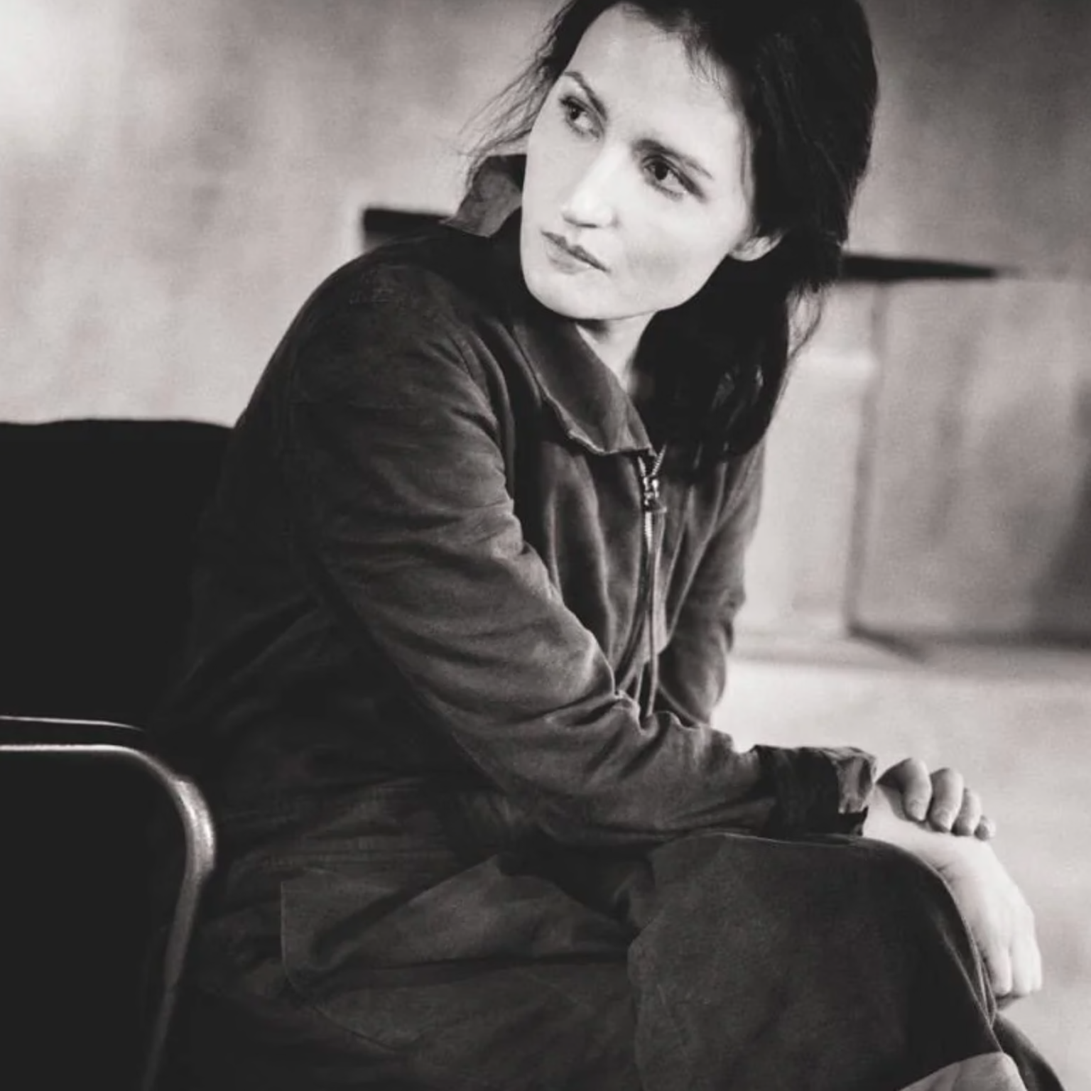
Carsten Rundholz is perhaps most famous for his unconventional design.

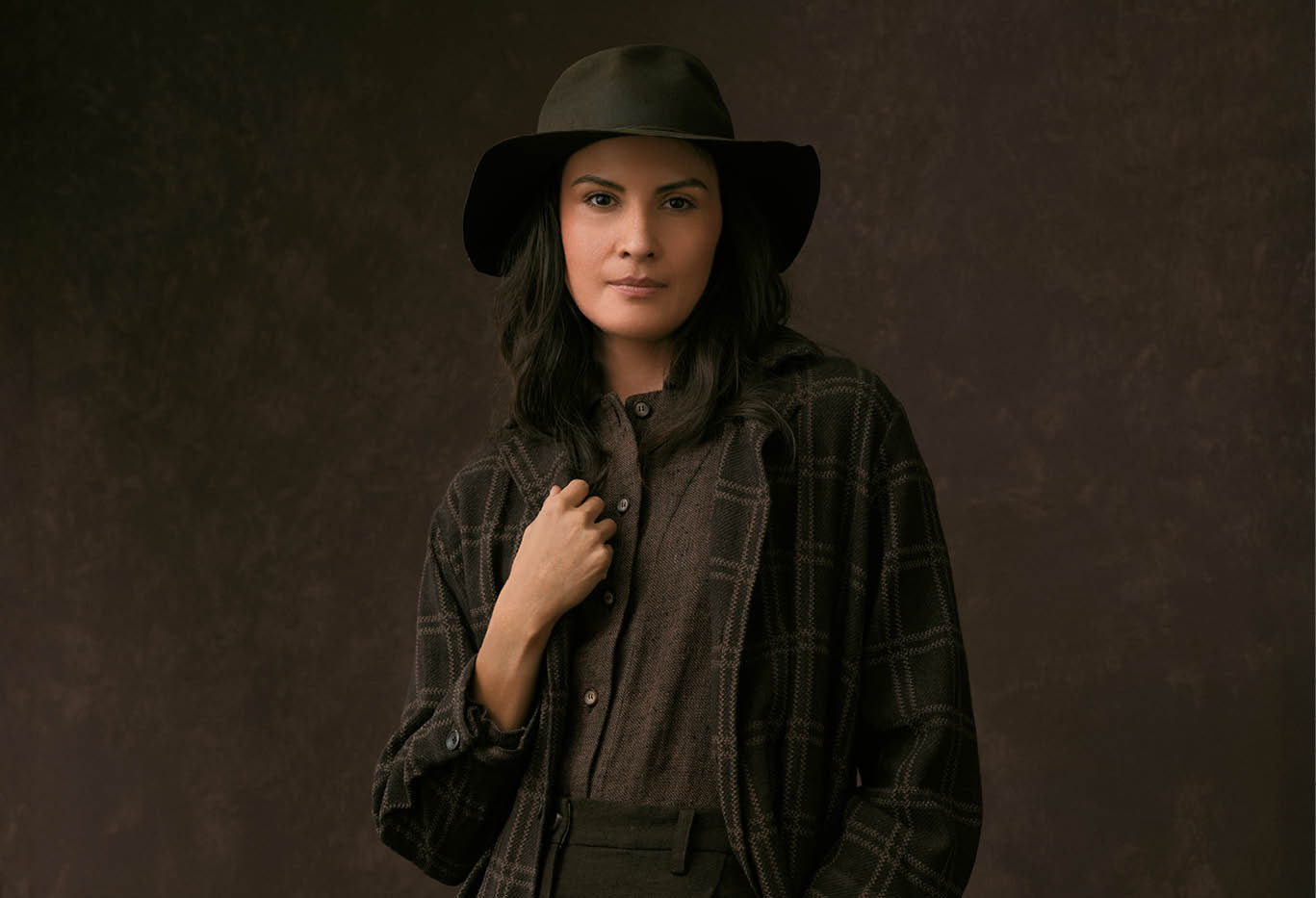
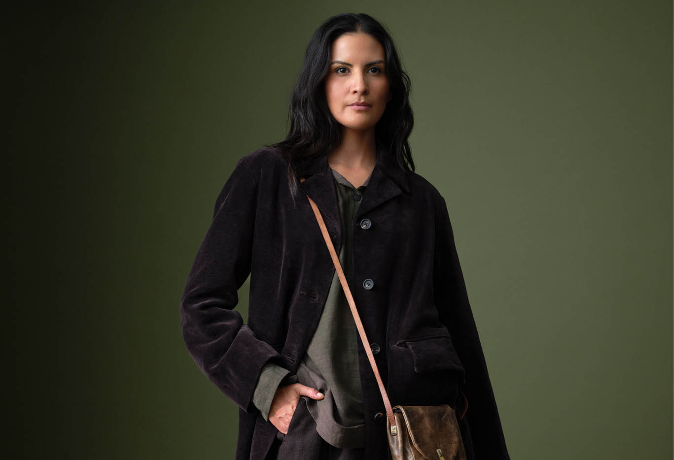
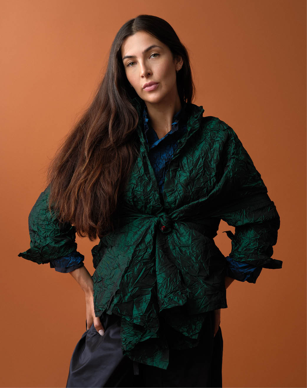
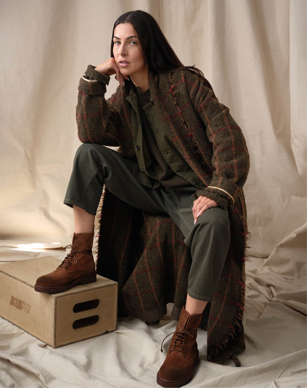
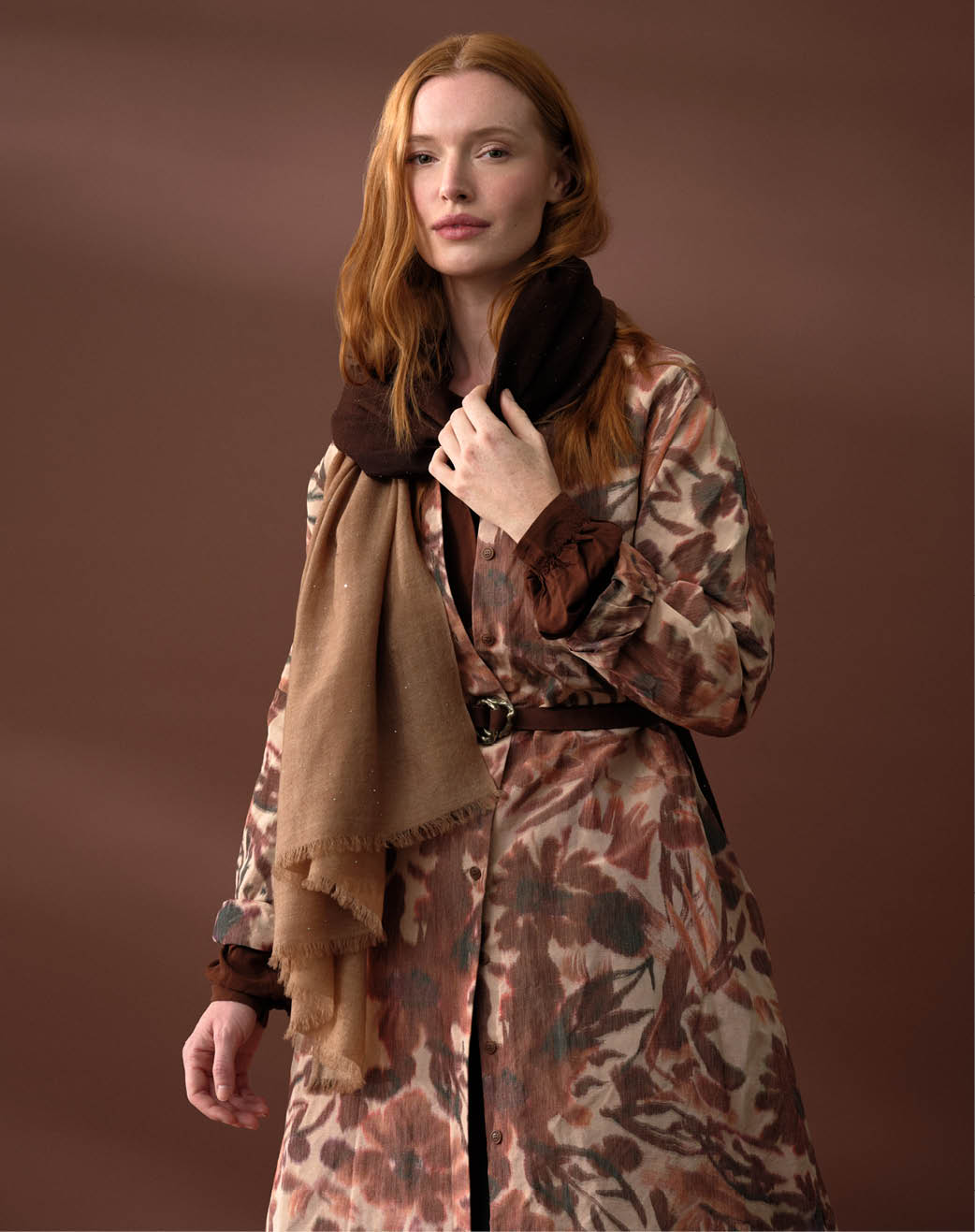
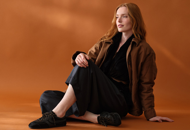
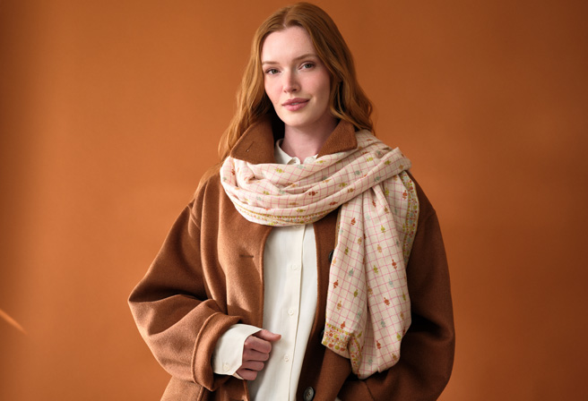
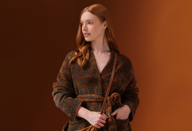
With each collection, he shows the world new ways to experience garments and fabrics we thought we knew. Post-COVID, his work took on new life – instead of structure being the delightful surprise, he turned to color to drive the themes of each delivery. This exploration of hue led him down a path few creatives dare trek – to infuse bold tones with such authority and grace that they are wholly transformed. Through this hard, deep work Carsten Rundholz once again teaches us something: the possibility of rich color to be worn as a neutral. Within this mastery of color harmony… therein lies his genius.

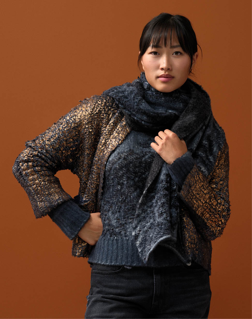
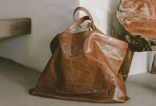
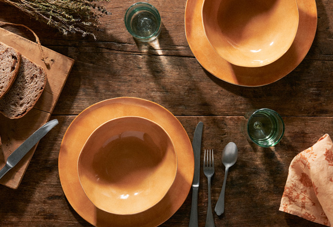
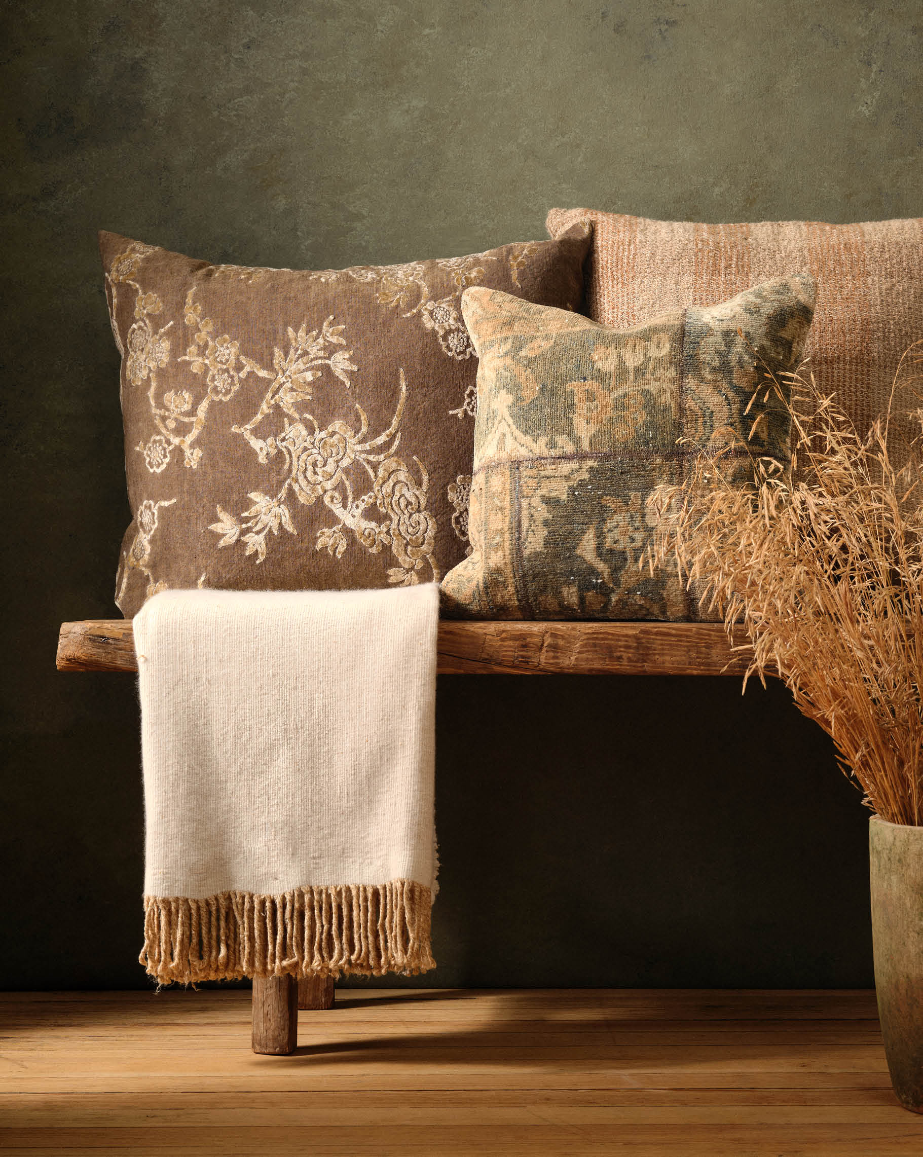
Most often one hears that the true neutrals are sand, ivory, taupe and other shades of beige. They are abundantly used in design as a shortcut to coordinate hues and ground a look. However, colors of nature, especially those rooted in the earthy spectrum, can all function in the same fashion – as Rundholz demonstrates through the ambers and rubies of this collection. Pinks can melt into brown when they have warm undertones, just as brown can go to cranberry when the tones are similarly matched.

By studying the effects and subtleties of his dyes and fabrics, Rundholz achieves an intense and versatile palette. Each piece is washed and dyed and re-washed through multiple color cycles to infuse them with an incredible harmony of hues.

