Author Archive

The Core of Sustainability

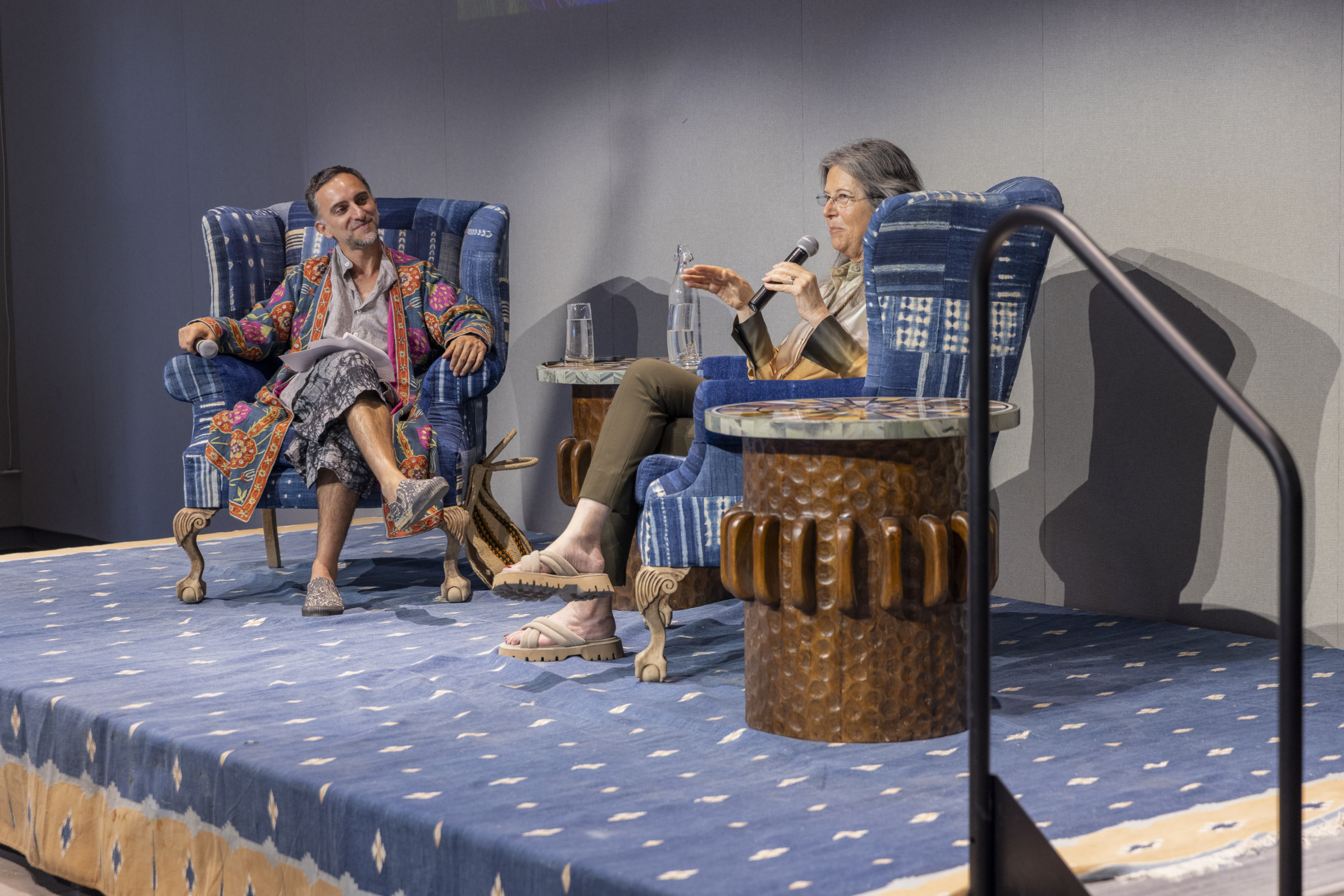
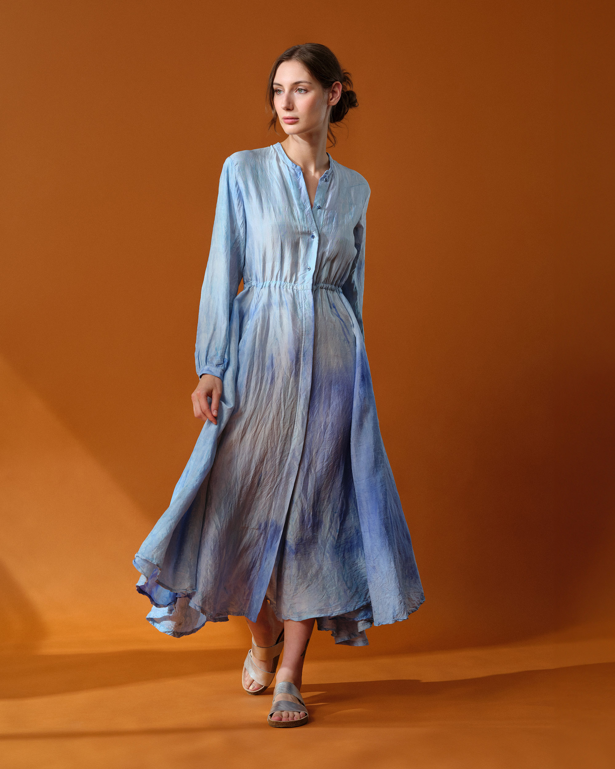
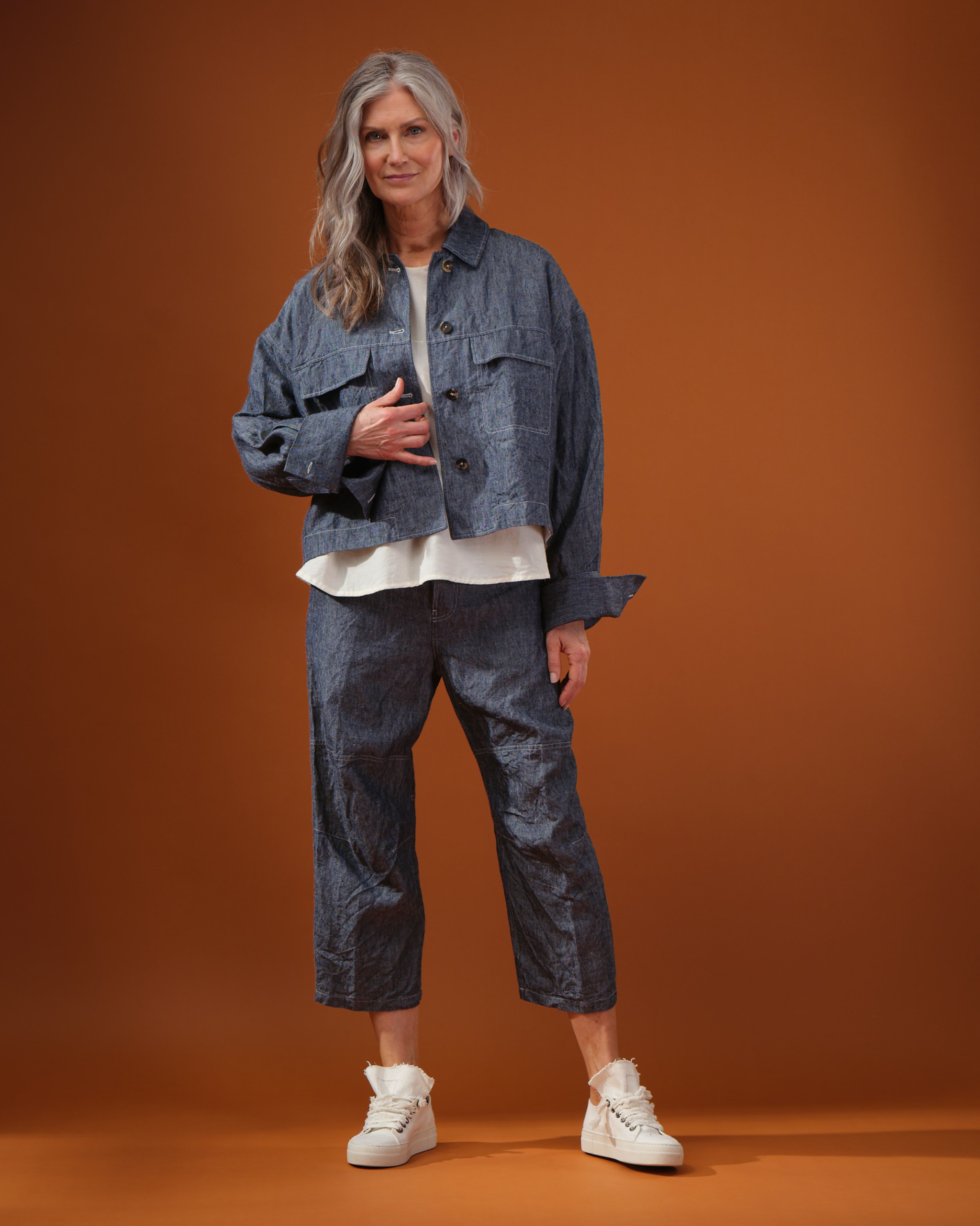
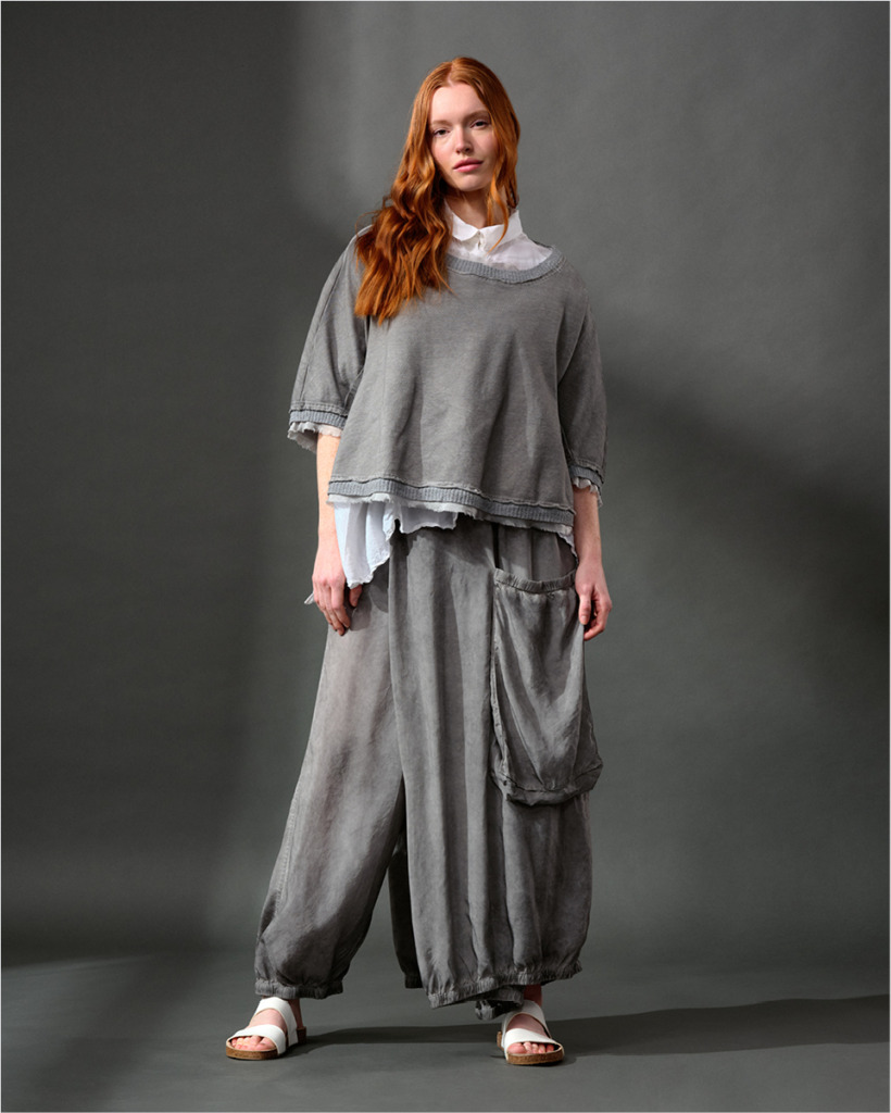
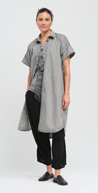
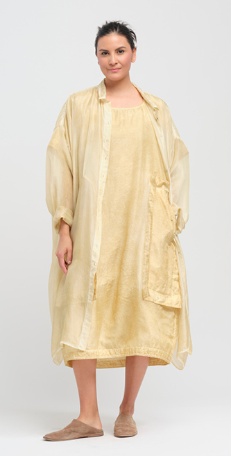
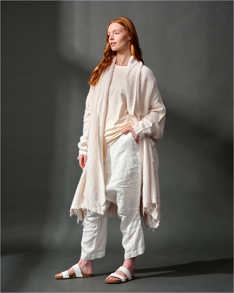
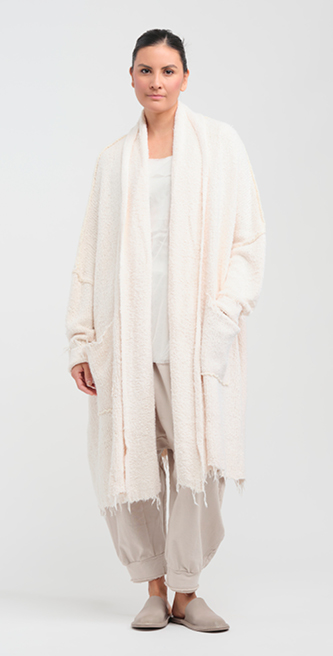
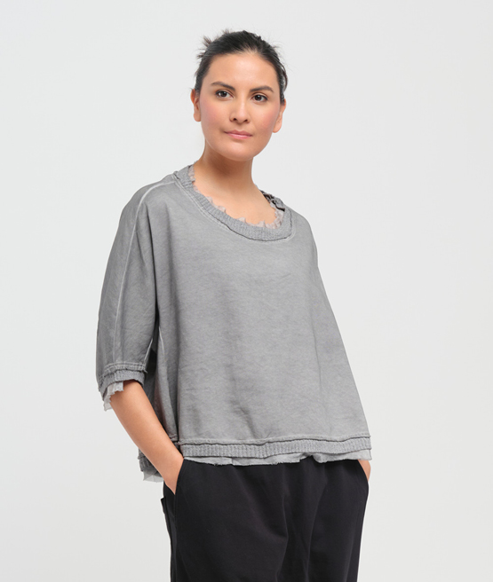
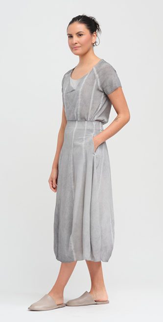
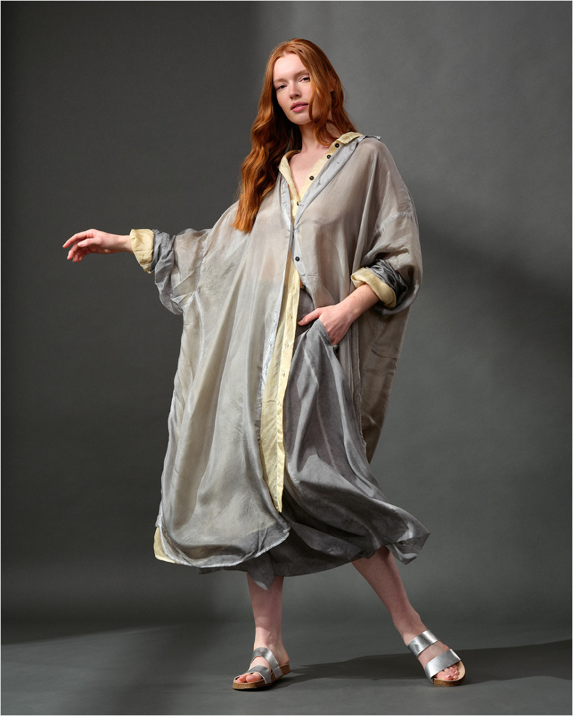
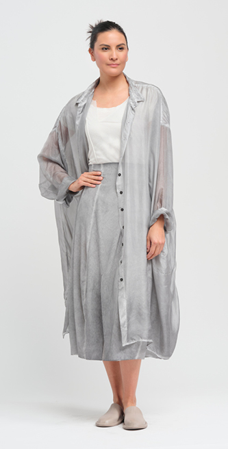
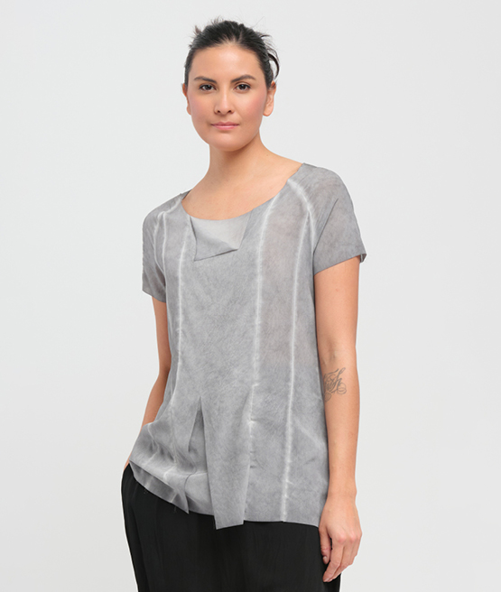
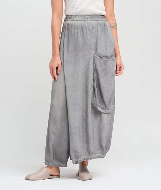
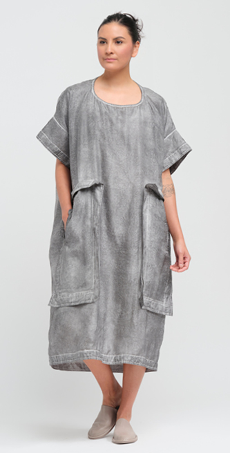
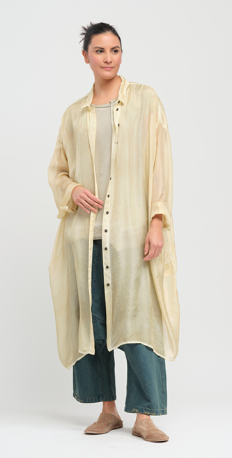
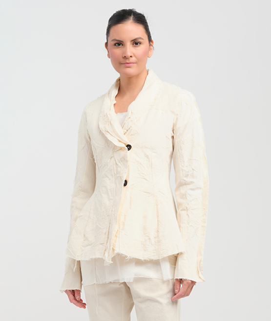
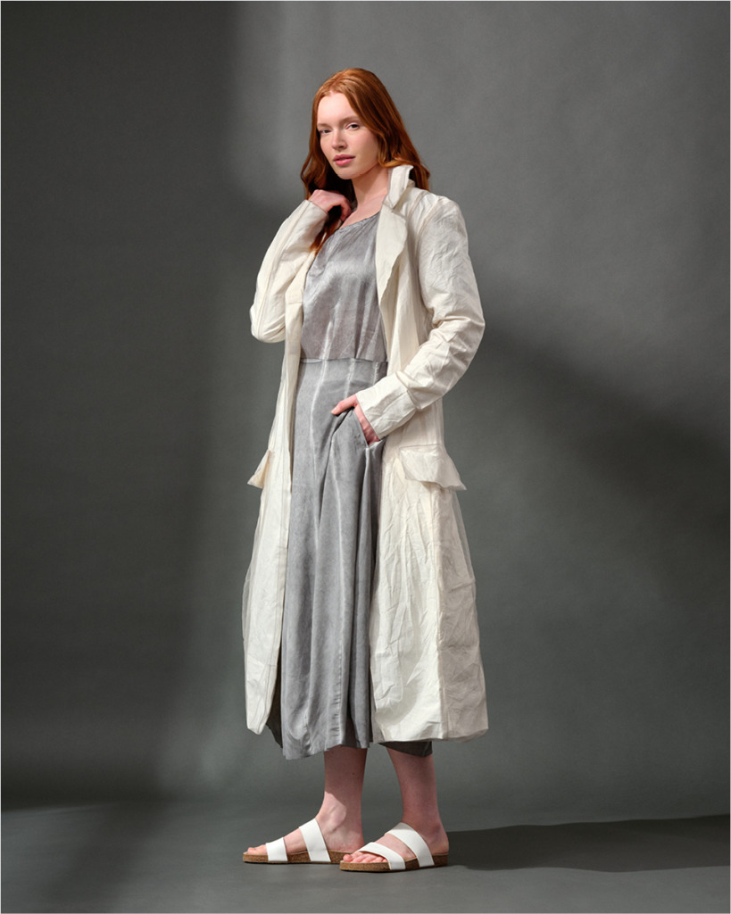
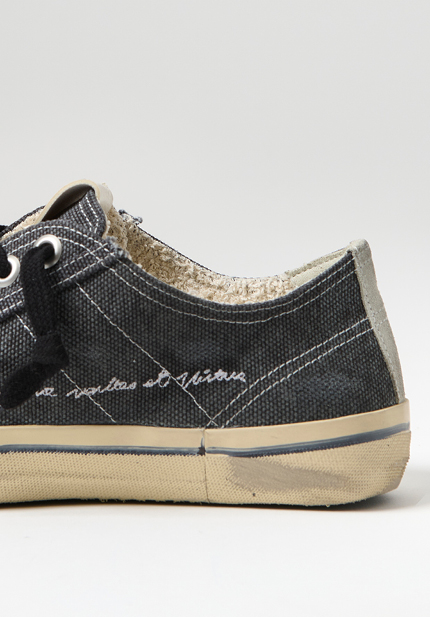
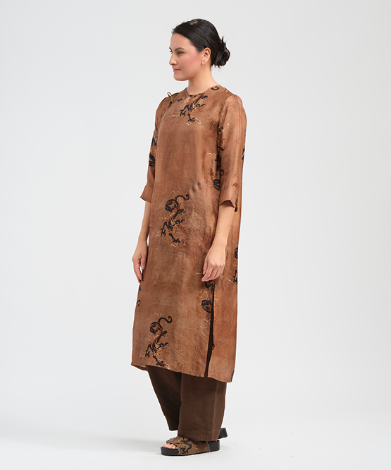
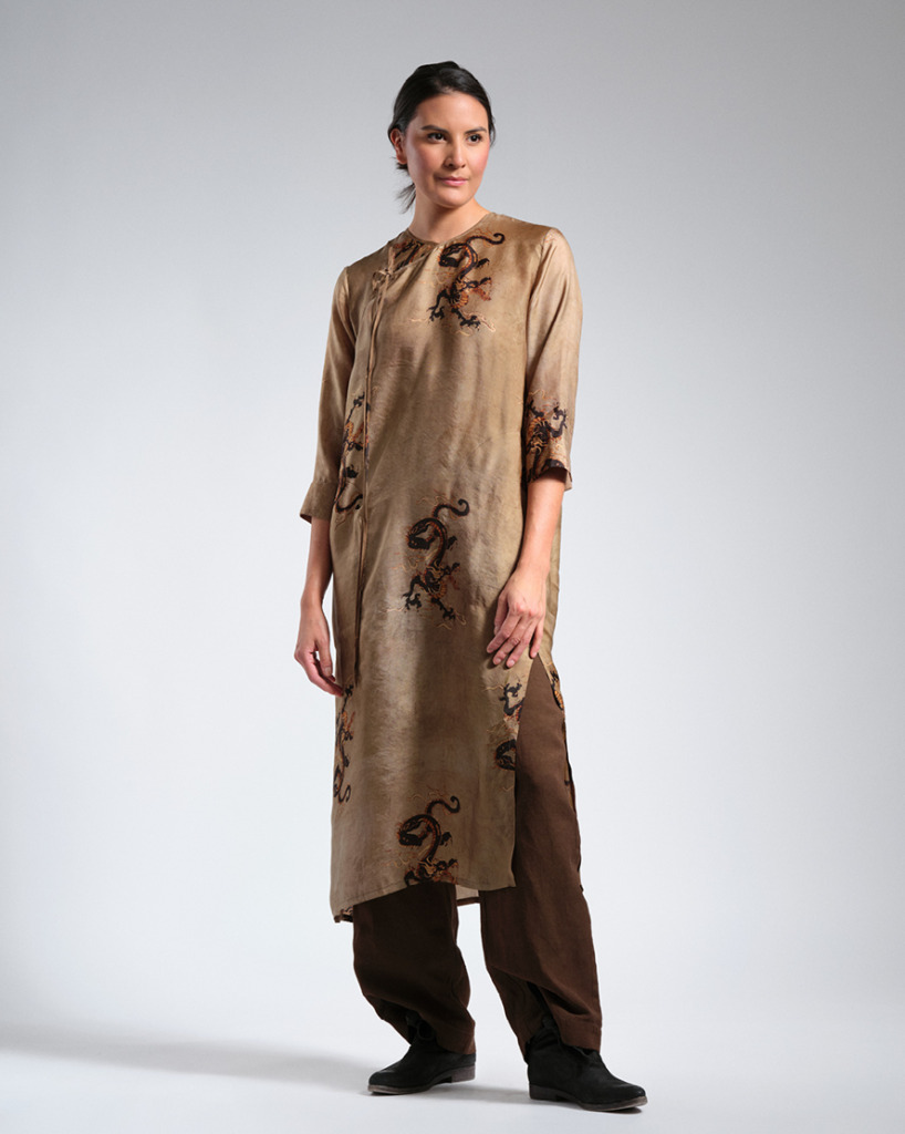
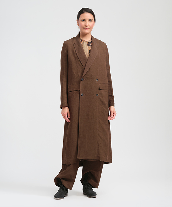
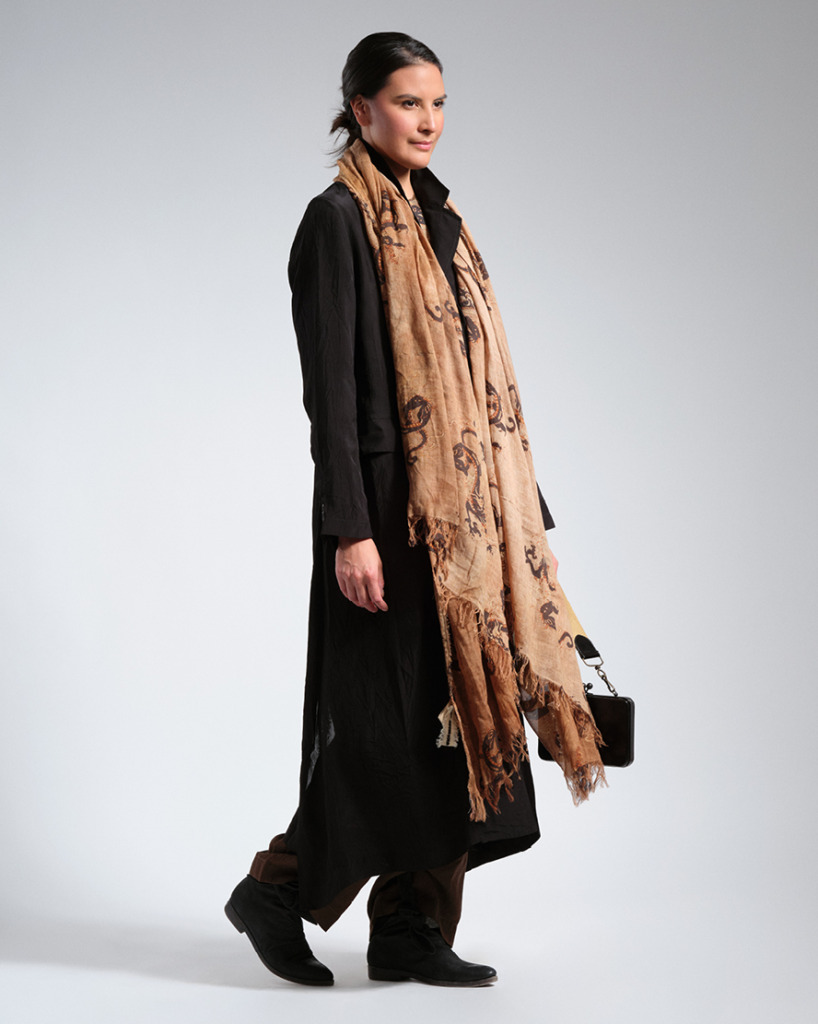
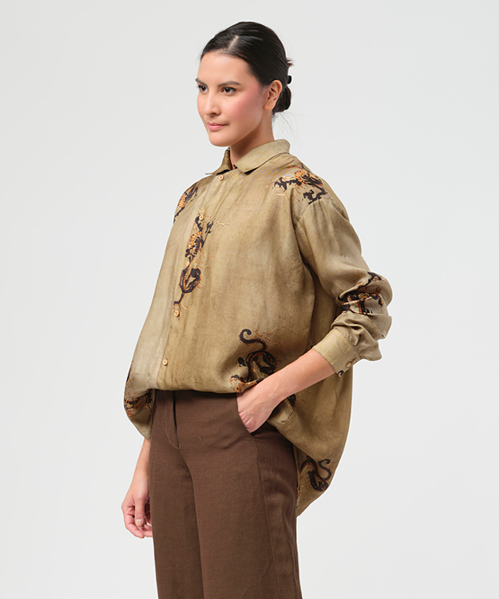
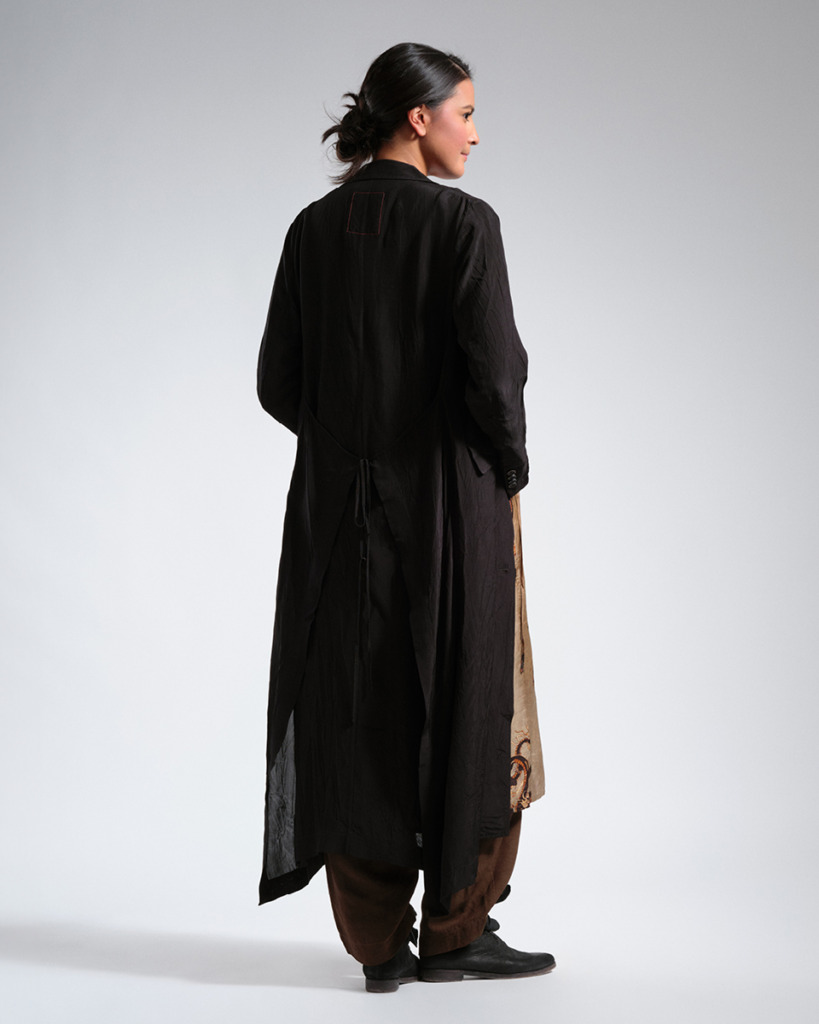
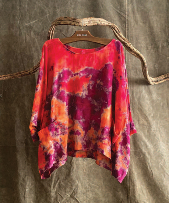
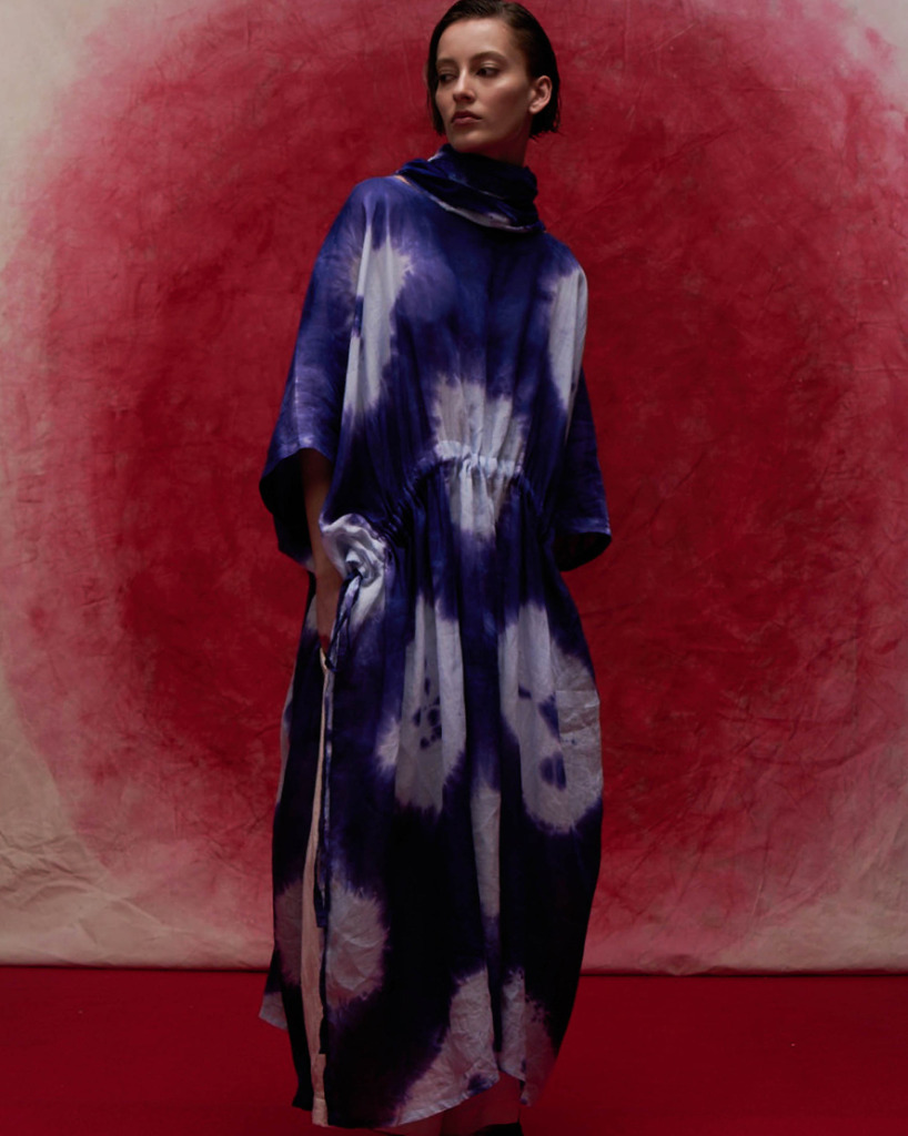
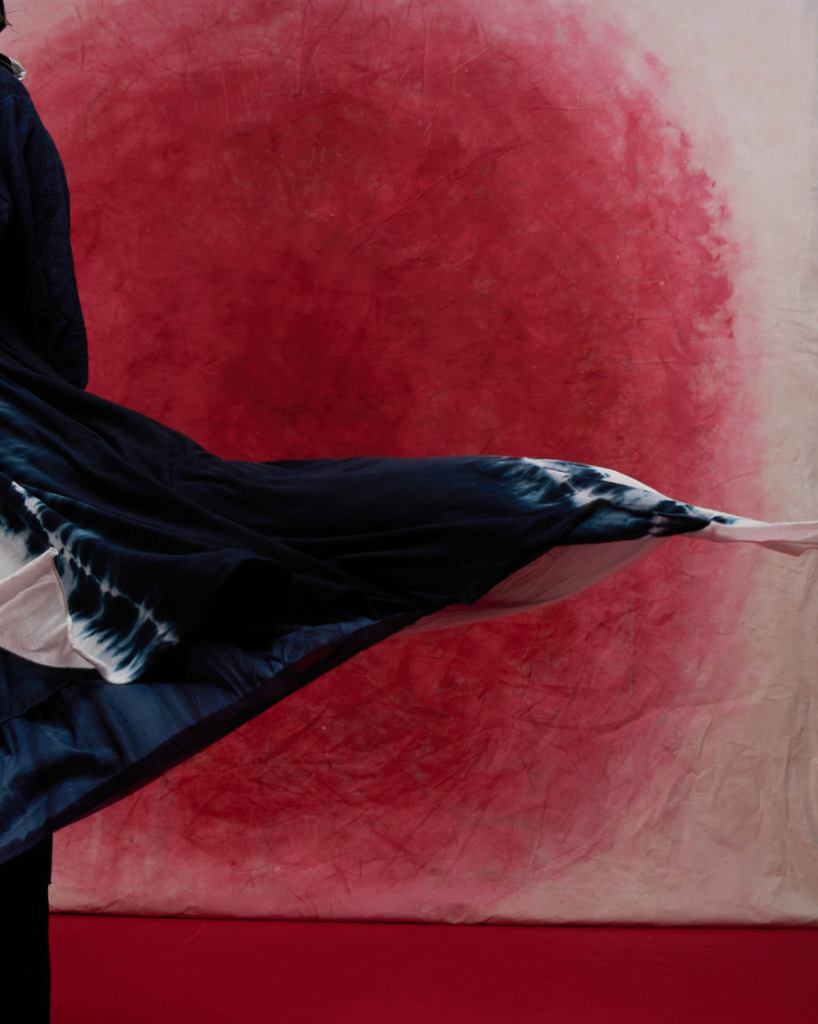
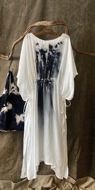
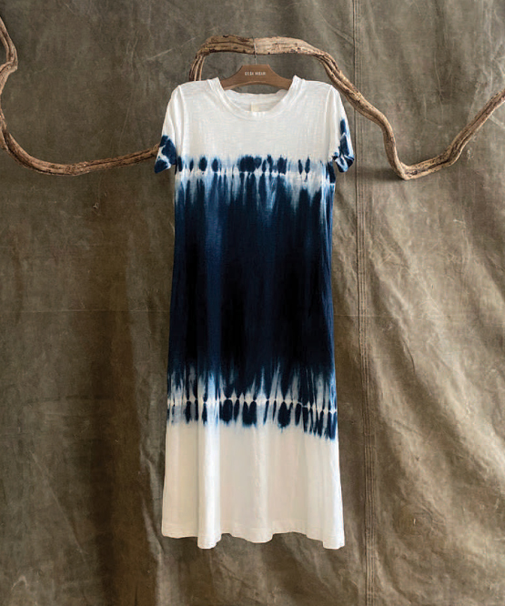
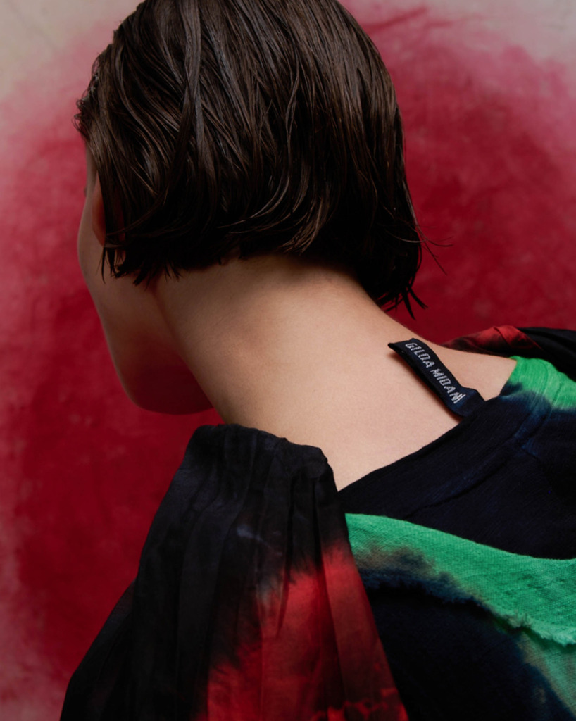
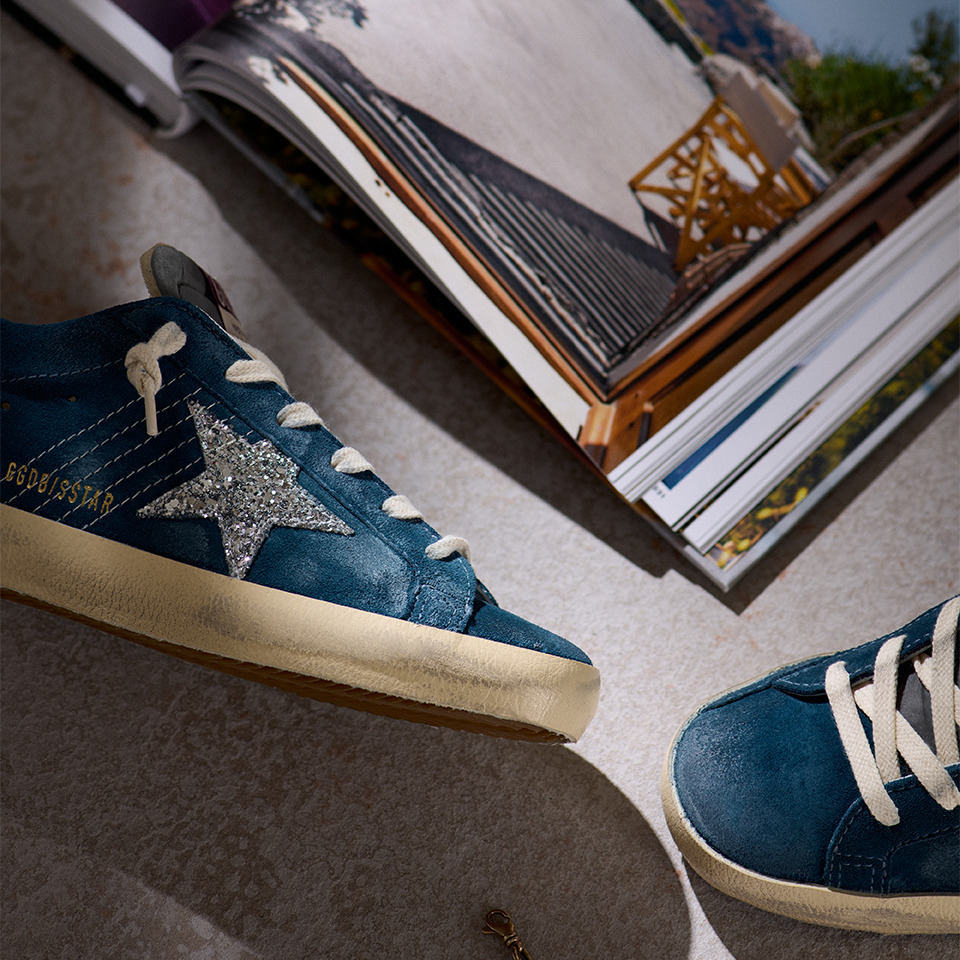
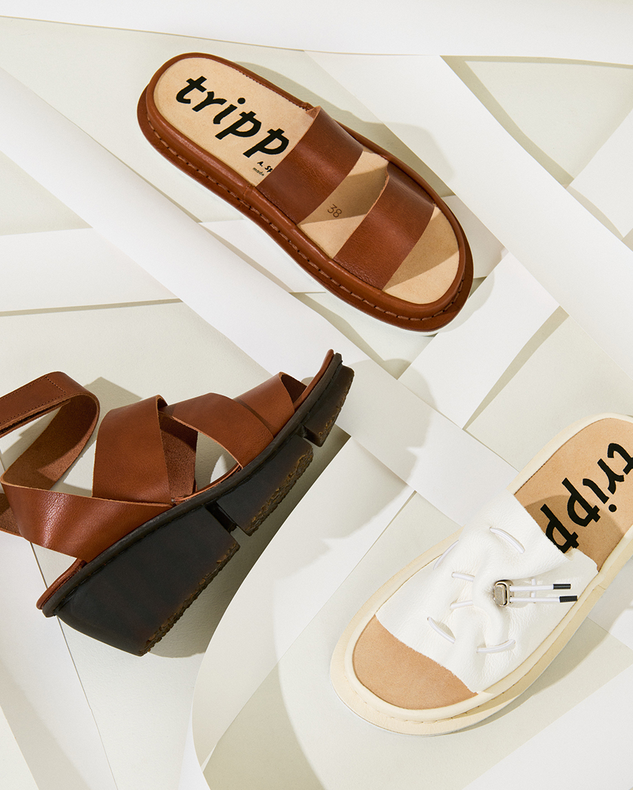
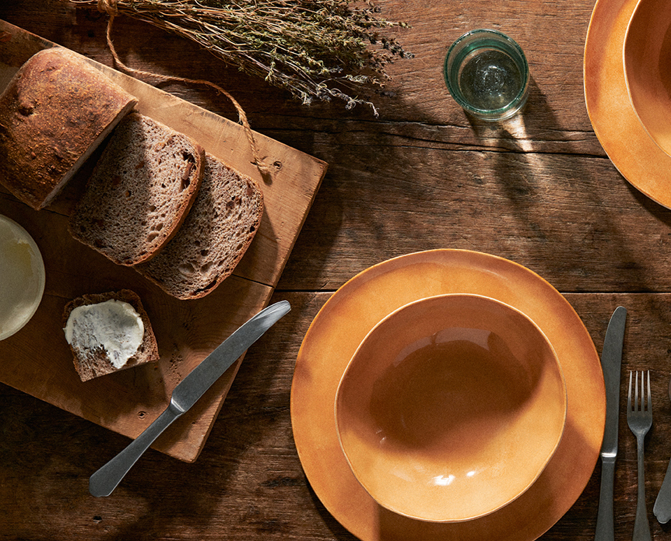
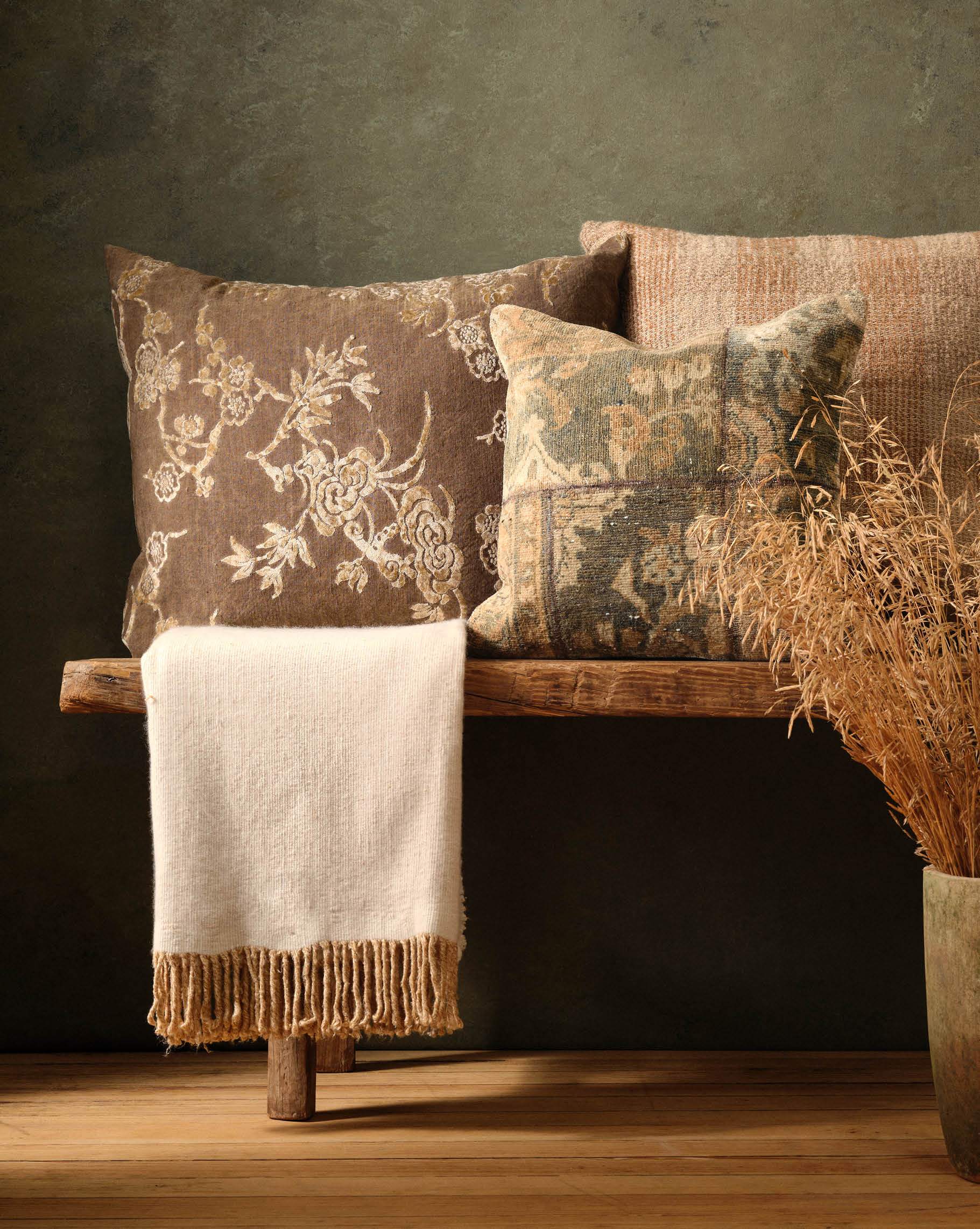
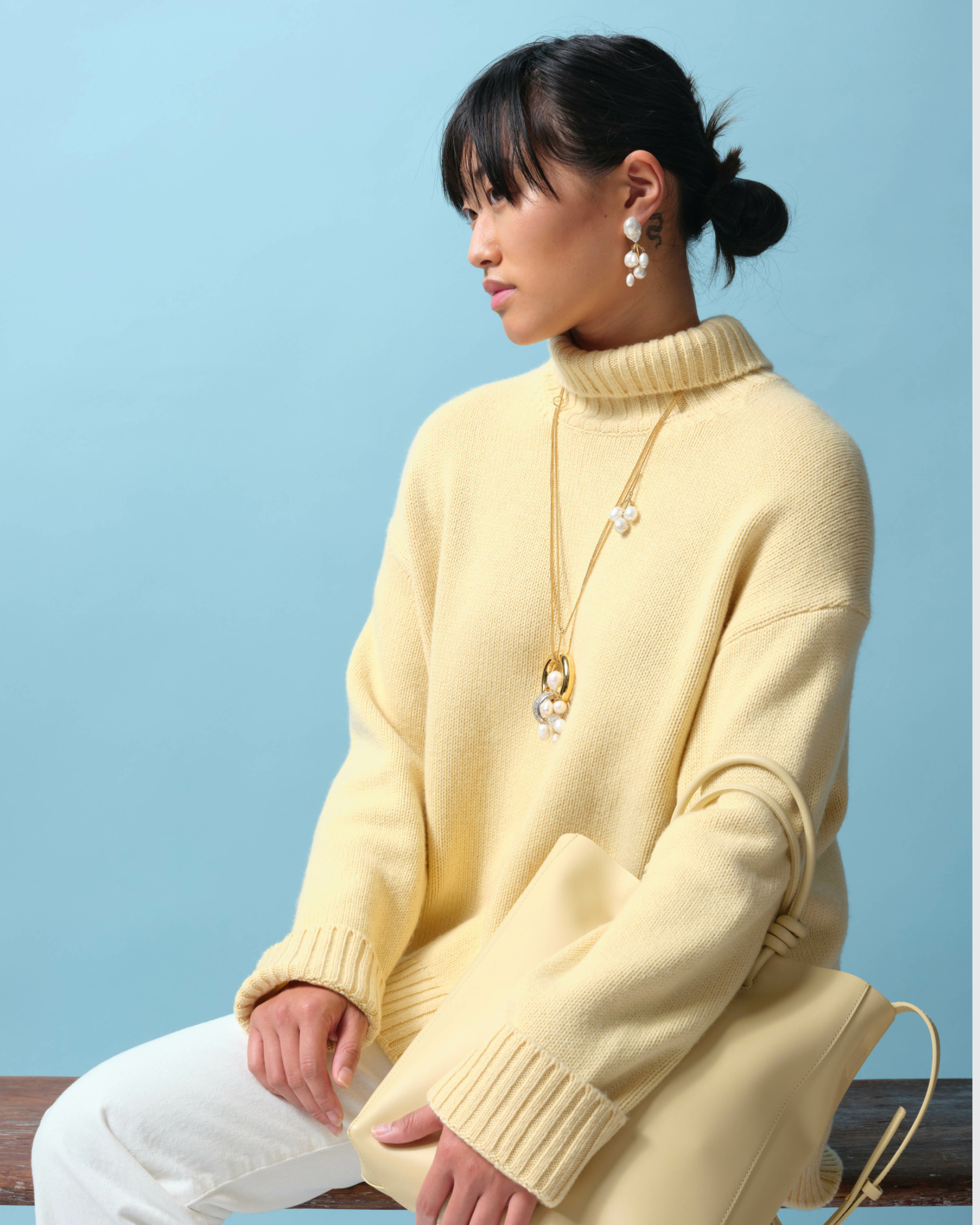
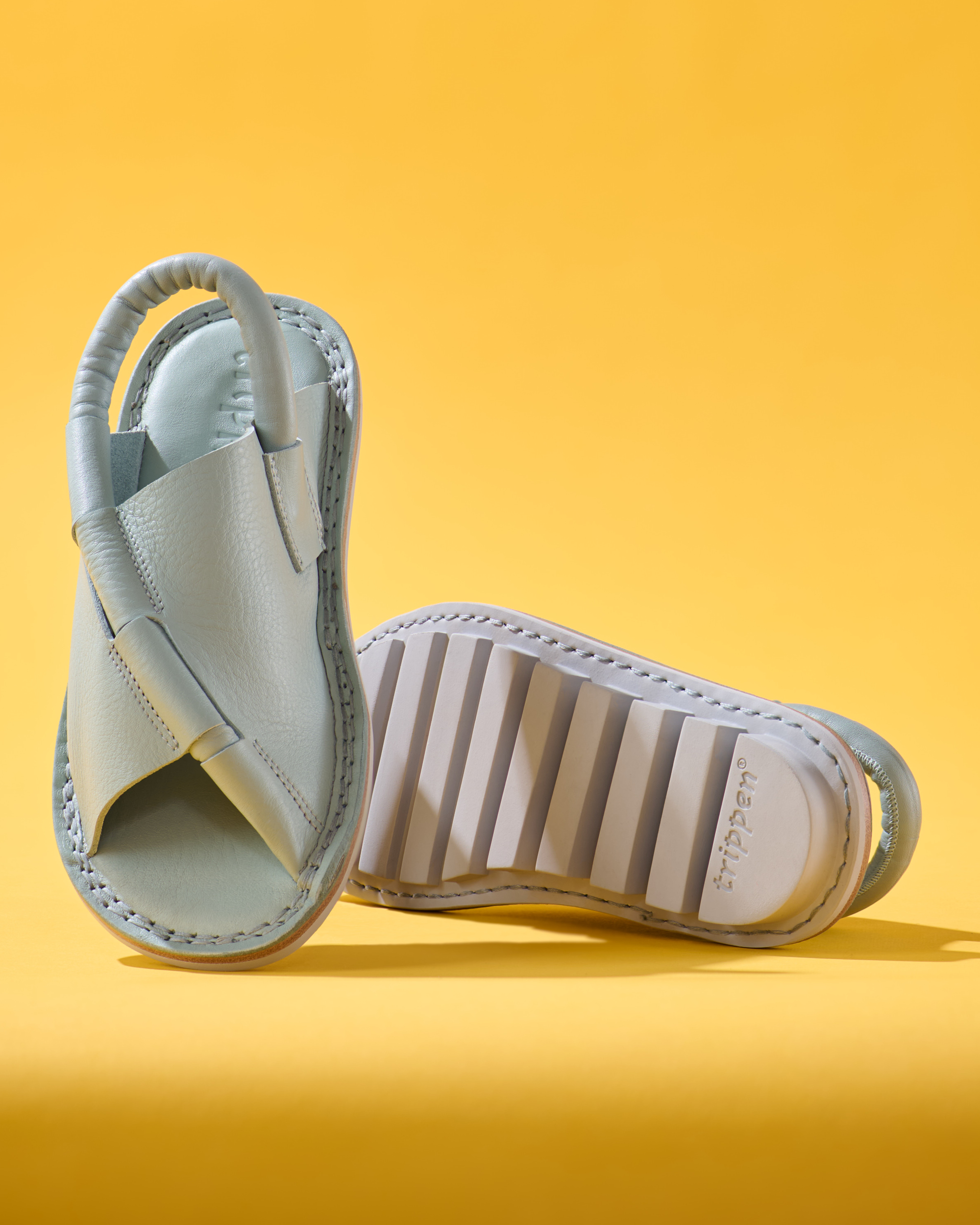
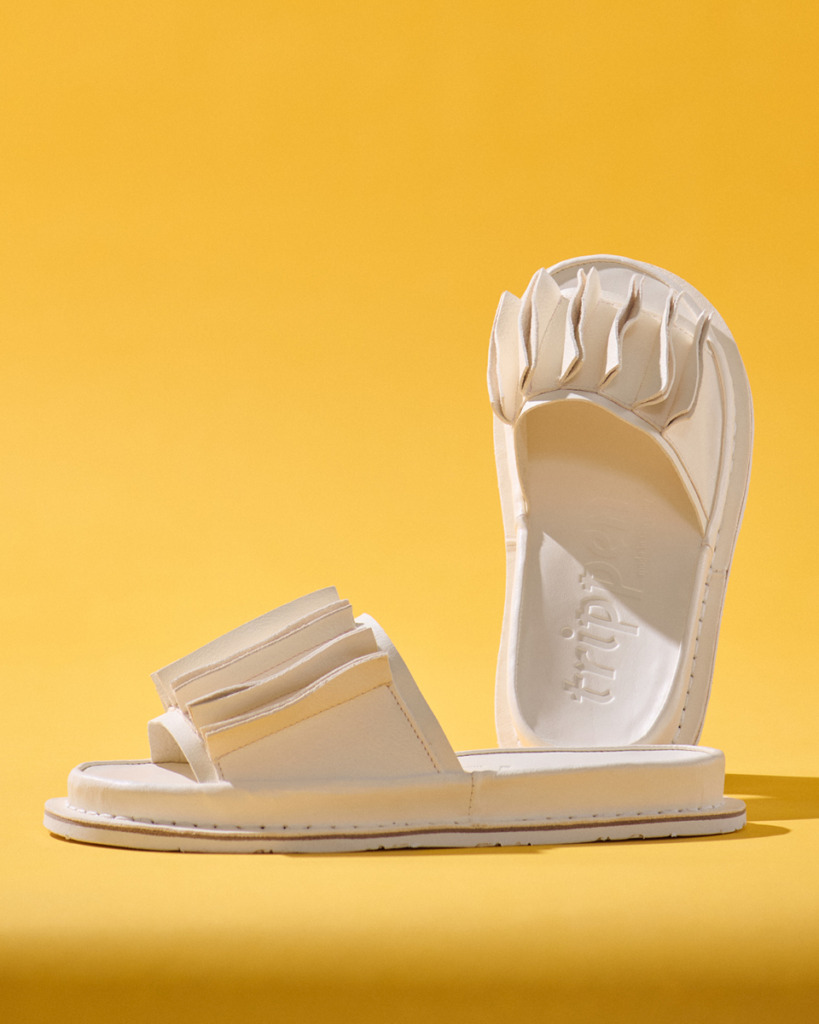
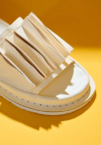
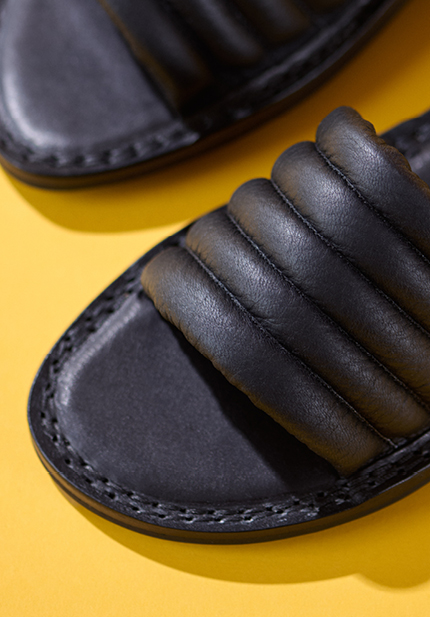
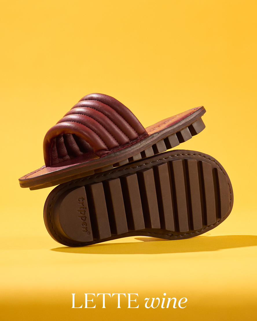
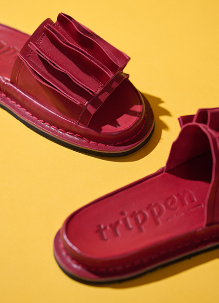
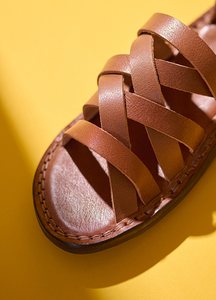
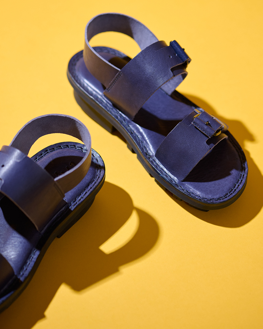
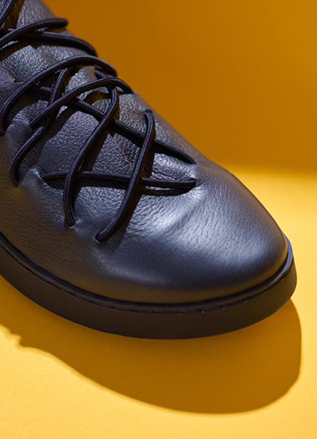
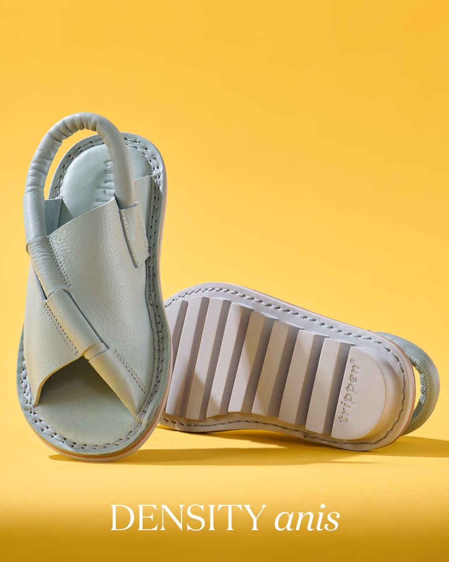
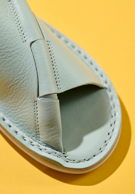
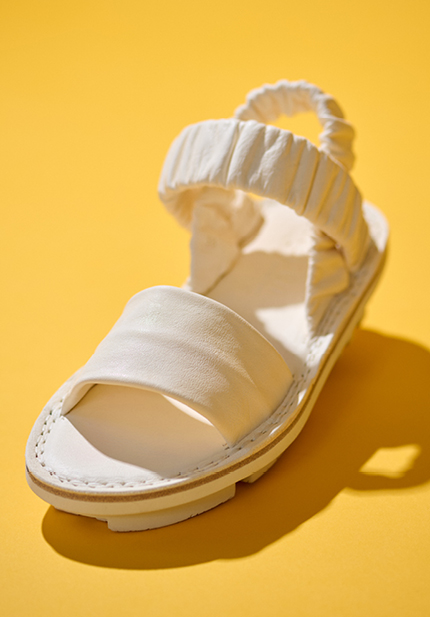
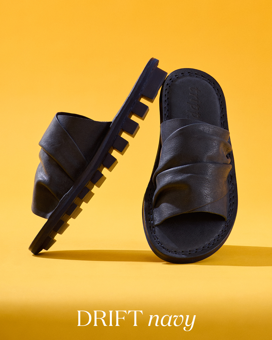
A look at Trippen’s Spring/ Summer 2024 and the brand’s ethos on sustainability. This season centers on sandal and shoe styles in wine, siena and anis blue leather, in addition to the brand’s signature black colorways.

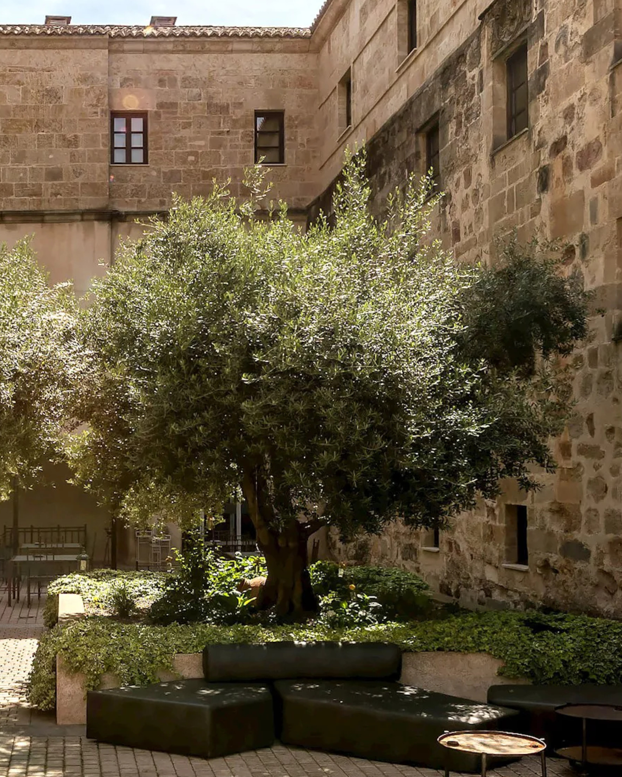
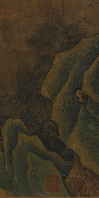
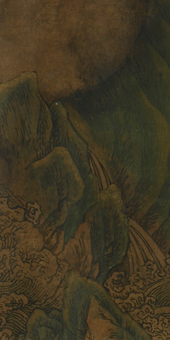
In Trippen’s Spring/Summer 2024 lookbook, the German label draws a connection between the scrabbled marble quarries of Carrara and its studio’s own use of the Earth’s resources. Carrara marble has long been twinned with the history of fine art – its creamy white finish can be found in sculpture and architecture around the world. Though the creativity fueled by this material has been breathtaking and important, Carrara itself has been mined to bits. This balance between creation and destruction turns Trippen pensive – what does it mean to create beautiful things without harming the source?

Since day one, founders Angela Spieth and Michael Oehler have felt a responsibility to the earth, tweaking their supply chain and production to be as sustainable as possible. Alongside designer Claudia Hoess, their ultimate aim as a studio is to design “circular” pieces that not only last a lifetime, but are made from environmentally sensitive sources to begin with.

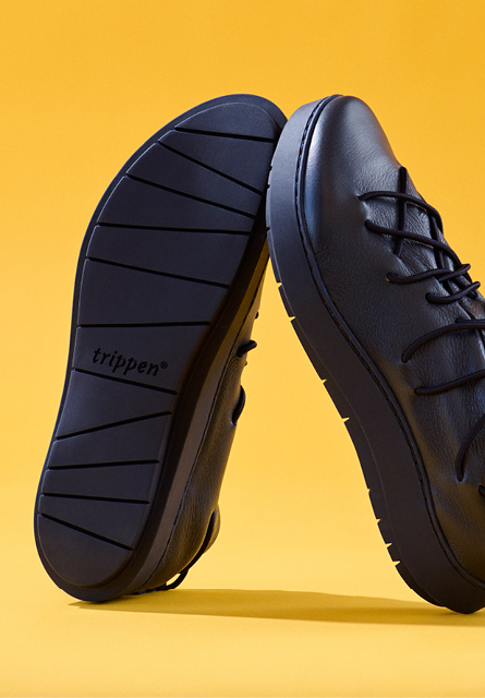
Trippen secures their leathers from a longstanding partner in Tuscany. The materials are tanned exclusively with vegetables – a process that produces little chemical effect and allows the material to patina naturally. Instead of harmful, industrial adhesives in their work, they opt to use water-based glue or hand-stitch their soles.

The designs prioritize durability and resilience – each pair is intended to be repaired and resoled as needed. This is one of the many things we adore about Trippen. To wear something made with such reverence to its source and materials is to forge a deeper connection to the earth. Practices like this are much more difficult than the convenience afforded by modern means – and in our opinion, much more rewarding. May we all feel so committed as we step forward into the future.

The earth bears many fruits, and new things always arise from the core.
Nature’s dynamic forces bring forth infinite creativity.
May we use them wisely.
May we return more than we take.

– The Trippen SS24 Lookbook

Shape Shifting

Streamlined and extremely wearable, this season’s Rundholz Dip focuses on silky essentials made for layering.

Carsten and Lenka Rundholz’s approach to design is similar to that of the ancient alchemical arts, transforming the seemingly mundane into something entirely different and enchanting. The duo will stitch together thin fabric panels into a sculptural dress, lace a jersey neckline with silk to create a hint of elegance or nick a hem to forge drama and drape. Just as ancestral alchemists mixed silver and gold to create platinum, Carsten and Lenka combine skirt cuts with the seaming of harem pants, creating a beautiful combination of the two. This is a studio focused on innovating fashion at its core – influencing the way we wear things and why we wear them.

One of the most fascinating presentations in Rundholz DIP’s spring is the creamy, mid-weight knits. What reads first as a subtly shiny cotton fiber is actually a 100% raw silk yarn. In addition to being incredibly soft, breathable and moisture-wicking, raw silk is a particularly strong fabric and highly resistant to pilling. Despite the intentional distressing in the design, this is a clever choice of material to use in these pieces – ensuring each will maintain their shape and finish for decades to come.

In another experimentation with silk, Carsten and Lenka have also sent along several tops, pants, skirts and dresses in stretch silk, a light-as-air material with a light sheen that conforms to the contours of the body. DIP’s special hand-dye methods work a bit of magic across this textile, modeling the grays a bit like concrete and steeping the blacks to a perfect midnight hue. The dyeing is what separates this line from Carsten and Lenka’s main Rundholz label. The entirety of DIP, including the works in Nessel white, have been colored and finished through specialized dip-dyeing, creating a unique patina across garment’s magic.

Introducing Kimberly Collins

Sapphire, emerald and tourmaline stacking rings from jeweler Kimberly Collins. Her work celebrates the three Cs: cut, clarity and color, opting for gem-first settings that ensure the stones are the star of the show.

Kimberly Collins’ story starts in 1995, with a life-changing trip to Nairobi, Africa, to learn the tanzanite trade. An entrepreneur at heart, her horizons were further broadened with trips to Sri Lanka and Bangkok, both places known for high-quality sapphires, rubies and storied gold traditions. After returning to the states, Kimberly moved to San Francisco and began the business that would eventually grow into her namesake collection. Now based in Nevada, her work celebrates the three Cs: cut, clarity and color, opting for gem-first settings that ensure the stones are the stars of the show.

Our selections from Kimberly are primarily rings from her Yumdrop collection – pieces that feature single high-color stones set against 18K gold. These are designed to stack and nest nicely together on the hand. Among the offerings are several eternity bands in white and black diamond – elegant pieces that add glitter to a larger stack.

Today, Kimberly continues to travel the world in search of her gemstones – choosing only those with high clarity, color and character. The specificity of this practice shines in her work – despite the simplicity of her settings, each ring has its own distinct presence and personality.

How to ring stack:

The number of rings you stack comes down to personal preference – the arrangement should have pizazz, but not be uncomfortable to wear. Too many rings on a single finger can look cluttered, while too few can look lackluster. We have found the best balance is between 3 and 5 per finger, and ideally to have multiple stacks scattered across the hand to create space and harmony. When stacking, start by creating a center stack and build your ultimate design around it – perhaps three pieces on a ring finger, two on the pointer and then one on the pinky for balance.

The trick to cohesion is to create a central theme, such as a matching shape, metal type or gem color. Because Kimberly’s rings share a bezel style and gold hue, we have found them incredibly easy to pair together, despite their disparate stones. The practice should be fun, easy and unleash a bit of creativity – we hope you enjoy it as much as we have!

Notes from the Field

Every year at the end of January, we repack our bags after Paris and head west for the Tucson Gem Shows. In addition to the main AGTA Show, there are also stones to be purchased at the Gem and Jewelry Exchange (GJX), the Gem Mall and the Holidome.

At the same time there are several other shows happening concurrently in New York City, during which new jewelry collections are released. As hunters, the week is a magical frenzy. Everyone brings out their best and brightest stones to share with the world and each is nothing short of dazzling… but you have to keep on your toes in order to snag the best stuff! We look forward to it not only because we love a challenge, but because we get to see some of our favorite friends and designers while out on the road.

We hit as many of the shows as we could while in Tucson, with a main focus on the Gem and Jewelry Exchange – which offers a concentration of stones from skilled lapidaries, who often directly own their mines. In between sleeping and shopping, we enjoyed a cappuccino at Cartel Roasting Co and walked down Stone Ave to 5 Points Market & Restaurant for dinner. We also made sure to stop by the historic Stillwell House on 5th to enjoy the garden, which is beautiful even in winter.

We came back to Santa Fe with an abundance – the Tucson Gem Shows are some of the best in the country for a reason. Included in our spoils are blue diamonds, raspberry sapphires, polished opal beads, Santa Maria Aquamarines from Brazil, and blood red Mozambique Rubies. One of our favorites finds was a selection of grandidierite – an incredibly rare, translucent mineral the color of ocean fog. We also sourced a nice bit of Castle Dome Turquoise, a scarce species once mined about 30 miles south of the Sleeping Beauty Mine in Arizona. Like SB, Castle Dome has a particularly vibrant color and can be identified by its distinct honey brown matrix. Find these stones and more at Santa Fe Dry Goods through our collaboration with Greig Porter later this year.

In some ways, the gem shows feel like a reunion – we often run into longtime friends and colleagues while browsing the floors, such as Denise BeteshMargery Hirschey and Lika Behar. This time of year also presents the perfect opportunity to make connections with new designers, such as Kimberly Collins, whose delicate gold stacking rings can be found in our cases later this week. While in Tucson, we also made sure to hop on a call with our East Coast friends showing in New York City, such as Yasuko Azuma, to secure our collections for the year. New additions to our family of jewelry designers will be announced later this year – and we are so excited to share them with you!

Ciao for now,
Shobhan & the Team

Perfect Imperfection

Golden Goose sprang from the desire to create sustainable, authentic footwear free of self-doubt. To achieve this, designers Francesca Rinaldo and Alessandro Gallo live and create by the motto “perfect imperfection.”

Each pair of shoes they design is shaped carefully, informed by generations of Italian craftsmanship. The process is tight, measured and precise… before being meticulously razed by the Golden Goose team to achieve a lived-in patina. In our first delivery for spring, find this ethos in spades, in denim, cherry red and glitter galore.

For Francesca and Allessandro, life is far from perfect… and that is just the way it should be. Scuffs, scores, tears in the fabric – what might be considered the damage of daily wear is celebrated by Golden Goose as a piece’s individual character and story. In pursuing anti-perfection, their designs focus on the little things. There may be a scrawl of writing on the upper of one shoe, an almost-invisible raised stitch on another. The intentionality to detail is what truly breathes life into each shoe and makes them a pleasure to wear.

“Injecting life in what we do gives space and a stage to everyone’s story.”

– Francesca & Alessandro

Year of the Dragon

This January marks the beginning of the Year of the Dragon, a much anticipated cycle in the storied Chinese Zodiac. Representing luck, tenacity and courage, the dragon is a powerful creature in Eastern mythology – inspiring fierceness and fire.

2024 is specifically representative of the “wood dragon.” Wood is an earthy element associated with growth and expansion, heralding new life and adventure to come. How fortuitous that Uma Wang’s Pre-Spring arrived in time to mark the Lunar New Year. With this delivery, she inspires a bit of the dragon in us all.

Rendered largely in cotton and vegetable silk, Uma focuses her creative energy on prints and textile in this capsule presentation. The core designs of the collection are pictographic prints that are then cold-dyed over to create a modeled, fresco-like patina. Slender dragons curl across the dresses and shawls, whose fabric was created for Uma by the impeccable House of Lyria studio in Prato, Italy. Several favorite garment styles make a reappearance with this collection, including the Katja jacket, the Tina tee and the Agina dress.

As you forge your path into the new year, we hope you do so with the same power and ingenuity found within Uma’s artistry. Boundless creativity such as hers drives us all forward, both aesthetically and intellectually. It is a pleasure to explore her works and discover the beauty possible at the intersection of genius, design, fierceness and fire.

Pearls of Wisdom

Pearls are incredibly unusual. They are one of the few gems that can’t be faceted and require no polishing to reveal their natural shine. The only stone created by a living organism, a single pearl can take between two to seven years to form within the mouth of an oyster.

During this genesis, iridescent layers of calcium-rich nacre are stratified around a “seed” of sand, building to a final, silken shape. Unlike other precious stones, pearls emanate a living essence, attracting the eye and imagination closer with every shift of the light.

Freshwater pearls may be the most familiar. The nacre is characterized by a signature warmth – a mix of cream, pink and yellow highlighted by a very pale blue. Though freshwater pearls can be found in a range of colors and shapes, the most prized are the lustrous, pure white stones with a marble-like profile.

The opposite of their perfectly round kin, Baroque pearls are an oft-freshwater variety defined by atypical, captivating forms. Due to their irregular surface, these gems are particularly prismatic. Bold designers, such as Monies, love this type of pearl for its unique character and sculptural presence.

South Sea pearls are among the most exquisite in the world. Found only in the tropical white-lipped oyster, these pearls are much larger and rounder than their Akoya and Freshwater counterparts. When nestled against 22 or 24K gold, a subtle glow winks from beneath their unique satin finish.

South Sea pearls are among the most exquisite in the world. Found only in the tropical white-lipped oyster, these pearls are much larger and rounder than their Akoya and Freshwater counterparts. When nestled against 22 or 24K gold, a subtle glow winks from beneath their unique satin finish.

Free Fit and Flowing Form

Gilda Midani describes garment design as a way to make the body “peaceful.” To free her wearer from the nag of fit and form is to refocus them on life’s sunshine.

This is where she begins her process, with an attention on how her chosen textiles feel against the skin; how a mix of dyes flows across the form; how a carefully placed seam adds definition to an otherwise unstructured silhouette. By mastering shape and color, Gilda achieves the impossible: a wearable ouvre that feels as joyful and easy as it looks.

Despite Gilda’s inherent levity, a spectrum of emotion is captured within her color – exuberant pink, energetic yellow, carefree aqua, resolute black. Navy waning into white for contemplative, orange splashed against red for confident. The possibilities are vast. You could spend hours analyzing her pieces and still only wade in her creative shallows.

Gilda pulls from a variety of sources to distill the essence of a life well. She draws inspiration from the modern sculptures of L’ Atelier Brancusi, obscure Impressionist painters and 14th Century Malinese architecture to understand the simplicity behind the complex. Her deliberate consciousness then permeates her pieces – an investigative thread weaving through ancestral batik dyeing, classical Italian seamwork and the best weaves for linen fiber. To count her work among your collection is to pursue these tenets yourself and revel in the ideal: the Gilda Midani definition of peace.

“My personal gallery is made up of the patterns the waves sketch on the beach… the imprint [of] time…. the deep forest where I find treasures…”

– Gilda Midani